
Photographers: 8 Step Phone Test to Find Best Mobile Portfolio Sites
Photographers: run an 8 step, ten minute phone acceptance test to judge mobile portfolio sites. See what to check and how PhotoView.io measures up.

Photographers: 8 Step Phone Test to Find Best Mobile Portfolio Sites
The best mobile portfolio sites reflow cleanly at narrow widths, keep project context intact as thumbnails shrink, and put a contact option within one thumb’s reach. You can confirm this in minutes: open a live demo on your phone, zoom the text to 200%, and see whether the layout still makes sense. One platform built specifically with photographers’ mobile presentation needs in mind will be checked against that same standard later.
TL;DR:
- A truly mobile-ready portfolio must reflow at 320 CSS pixels wide without horizontal scrolling and support 200% text resizing without content loss.
- Practical testing involves rotating screens, zooming text, checking touch targets, and verifying contact form functionality on a real phone under varied conditions.
- Leading design patterns include prioritizing key images and contact options, organizing content by relevance, and serving appropriately sized images for optimal speed and clarity.
- Comparing platforms requires testing live demos on a phone, ensuring smooth video playback, private galleries, and seamless updates from tools like Lightroom.
- PhotoView.io is built specifically for mobile-first portfolios, supporting Lightroom publishing, fast gallery updates, and organized workflows tailored for photographers.
PhotoViewphotoview.ioPresent Your Work Beautifully AnywherePhotoView helps photographers publish responsive portfolios, mobile-ready presentations, and updated website embeds from one organized dashboard.Visit PhotoView
Table of Contents
- What “mobile-optimized” actually means
- A phone-based acceptance test you can run in ten minutes
- Design patterns that hold up on a small screen
- How to choose a mobile portfolio platform
- Why PhotoView.io fits photographers who need mobile-first portfolios
- Inspiration sites versus platforms you can actually publish on
- Comparing popular mobile portfolio platforms
- Making your portfolio load fast on mobile
- Responsive images and media done right
- Prioritize what your mobile viewer actually needs to do
- See how PhotoView.io handles the mobile test
- FAQ
- Sources
What “mobile-optimized” actually means
“Mobile-optimized” gets used loosely, so it helps to have a concrete standard instead of a marketing claim. The clearest one comes from the W3C’s guidance on applying WCAG 2.2 to mobile, which sets out testable behaviors rather than vague promises.
A mobile-ready portfolio reflows at a width equivalent to 320 CSS pixels without forcing the viewer to scroll sideways. That single criterion catches most broken mobile templates: image grids that clip, text that runs off the edge, navigation bars that stay fixed at desktop width.
Text resizing matters just as much. The same guidance calls for support of 200% text resize without losing content or functionality, which means captions and project titles need room to grow, not a fixed-height box that truncates them.
Beyond layout, there are interaction details that separate a portfolio that merely looks responsive from one that actually works on a phone: touch targets large enough to tap accurately, visible keyboard focus for anyone navigating without a mouse, support for orientation changes between portrait and landscape, and respect for a visitor’s reduced-motion preference. None of these show up in a screenshot. They show up when you actually use the site on a device, which is the only way to judge a platform honestly.

A phone-based acceptance test you can run in ten minutes
Rather than trusting a builder’s marketing page, run the same acceptance test The Crit recommends for mobile portfolio design: a short sequence of checks performed on a real phone, not a desktop browser resized to look small.
- Load the home page and a project page in portrait, then rotate to landscape and confirm nothing clips or overlaps.
- Shrink the browser to a 320-pixel equivalent width and check that no element forces horizontal scrolling.
- Open a project with a long title and a mix of photos and video to see how the template handles uneven content.
- Zoom the text to 200% and confirm captions, menus, and buttons still work rather than overlapping or disappearing.
- Navigate the whole page using only the keyboard or a screen reader’s basic gestures to see if focus order makes sense.
- Turn on your device’s reduced-motion setting and check that transitions respect it.
- Switch to a slow connection, or simulate one, and watch how images and embedded video load.
- Submit the contact form to confirm it actually sends and gives you a clear confirmation.
This sequence mirrors the practical testing workflow that combines mobile usability tasks with W3C’s accessibility criteria, and it takes about as long as scrolling through the platform’s own demo gallery.
Pro Tip: Test on a mid-range phone with a throttled connection, not your newest device on fast WiFi. That gap is where most “responsive” portfolios quietly fail.
Design patterns that hold up on a small screen
A portfolio that reads well on mobile isn’t a shrunken version of the desktop site. It’s a different set of decisions about what to show first and how fast a viewer can act on it.
- Lead with a strong hero image and a short project summary instead of a paragraph of background.
- Order thumbnails by relevance to the work you most want seen, not by upload date.
- Keep a contact option visible at all times, whether that’s a sticky button or a persistent menu item.
- Make a résumé or about link easy to find within one or two taps, not buried three menus deep.
- Size tap targets generously so a thumb on a crowded subway platform doesn’t miss.
- Serve images through srcset and sizes attributes so a phone downloads an appropriately sized file instead of a full desktop image.
- Keep captions short, and avoid hero compositions built around wide aspect ratios that only make sense on a monitor.
A gallery that looks cinematic on a 27-inch display can collapse into an unreadable column on a phone if the layout wasn’t built with both in mind from the start.
How to choose a mobile portfolio platform
Picking a platform comes down to a buyer’s job: show your work convincingly, make it easy to get in touch, and keep the site current without a redesign every season. A short checklist keeps the decision grounded in what you’ll actually experience.
- Test the platform’s live demo pages on your own phone, not just the editor preview, since editors often render differently than published pages.
- Confirm video playback, private gallery access, and proofing links work the way a client would expect.
- Check whether publishing from Lightroom or importing directly from your phone fits into your existing workflow.
- Ask how live embeds update when you add new work, since some platforms require a manual republish every time.
- During a free trial, measure how fast a new gallery actually goes live, whether basic SEO fields are included, and whether a test contact form reaches your inbox reliably.
These are the same checks worth running against any shortlist, PhotoView.io included.
Why PhotoView.io fits photographers who need mobile-first portfolios
This platform was built around the specific job this article has been describing: present finished work beautifully on a phone without photographers having to manage a separate mobile build. Photographers store and curate photos and videos in one dashboard, then publish through more than 30 responsive templates designed to hold up on mobile from the first load.
The mapping to the acceptance checklist is fairly direct. Lightroom publishing means a gallery update happens once and appears everywhere, including live embeds on an existing site, which addresses the “republish friction” that trips up other builders. Smart Folders keep large bodies of work organized without manual sorting on every upload. Private sharing and multiple galleries cover the proofing and client-delivery use cases that photographers need tested on a phone, since that’s often where a client reviews a gallery first.
The honest next step is the same one recommended throughout this article: run the ten-minute acceptance test on a published PhotoView portfolio or a solutions page and judge it the same way you’d judge any other platform.

Inspiration sites versus platforms you can actually publish on
A common mix-up is treating inspiration galleries as if they were hosting options. Sites like Figma’s curated portfolio examples and Dribbble’s mobile-portfolio search results are discovery destinations. They show you what a strong layout or an unusual interaction looks like, but they aren’t places where you publish your own work.
A website builder, by contrast, is the tool that actually stores your images, generates your pages, and keeps your site live. The confusion matters because a layout you admire on Dribbble might rely on interactions or typography that break the mobile reflow and text-resize behavior covered earlier. Before borrowing a pattern, open it on a phone and check orientation changes and navigation the same way you would a finished portfolio.
Treat inspiration sites as a mood board and treat your publishing platform as the thing responsible for whether that mood board actually works once a client opens it on a train with one bar of signal.
Comparing popular mobile portfolio platforms
Most photographers choosing a platform are weighing general-purpose website builders against tools built specifically for visual portfolios. The general builders tend to offer broad customization and a wide template library, but mobile behavior varies template to template, which means the acceptance test matters more, not less, when you’re evaluating one.
Photography-specific platforms, PhotoView.io among them, narrow the choice to templates already designed around image-heavy, mobile-first presentation, plus workflow features like Lightroom publishing and private client galleries that general builders rarely include. A 2016 subscriber survey of more than 800 photographers found real satisfaction differences across portfolio builders at the time, which is a useful reminder that these tools are not interchangeable, even though the specific rankings from a decade ago won’t reflect current mobile performance. Whichever category you lean toward, the fair comparison happens on a live demo page, on your phone, using the same checklist.
Making your portfolio load fast on mobile
Speed is part of mobile optimization, not separate from it. A portfolio that passes every reflow and accessibility check still loses viewers if the home page takes ten seconds to paint on a mobile connection.
Compress images before upload rather than relying entirely on the platform to do it, and favor modern formats like WebP where the platform supports them. Limit how many full-resolution images load above the fold. A hero image and a few key thumbnails are enough to start; the rest can load as the viewer scrolls.
Avoid autoplaying video on the home page, since it competes with image loading for bandwidth and often gets blocked by mobile browsers anyway. Lazy-load anything below the first screen so the initial view renders fast even on a throttled connection, which is exactly the condition worth testing from the acceptance checklist above. If you maintain your site independently, tools and guides focused on mobile display troubleshooting can help diagnose slow-loading elements platform by platform.
Responsive images and media done right
Serving the right image size to the right device is the single biggest lever for both speed and visual quality on mobile. Using srcset and sizes attributes lets a phone request a smaller file than a desktop monitor would, instead of downloading a full-resolution image and scaling it down in the browser.
Art direction matters too: a wide panoramic crop that reads beautifully on a monitor may need a tighter vertical crop on a phone to keep the subject legible. Platforms that generate multiple image sizes automatically save you from manually exporting a dozen versions of every photo.
For video, keep file sizes reasonable and provide a poster image so the page doesn’t stall waiting for a full video file to buffer. Keep media choices intentional rather than defaulting to whatever worked on the desktop layout.
Prioritize what your mobile viewer actually needs to do
A potential client on their phone has three tasks: find relevant work fast, judge whether you can do the job, and contact you. Everything else is secondary. Shorten project intros to a sentence or two, and keep a one-tap contact option visible from the first scroll. Mobile polish matters less than mobile usefulness.
— Mitch Russo
See how PhotoView.io handles the mobile test
If you want to run the checklist above against a platform built for photographers from the start, open Photoview and try a live portfolio on your own phone.
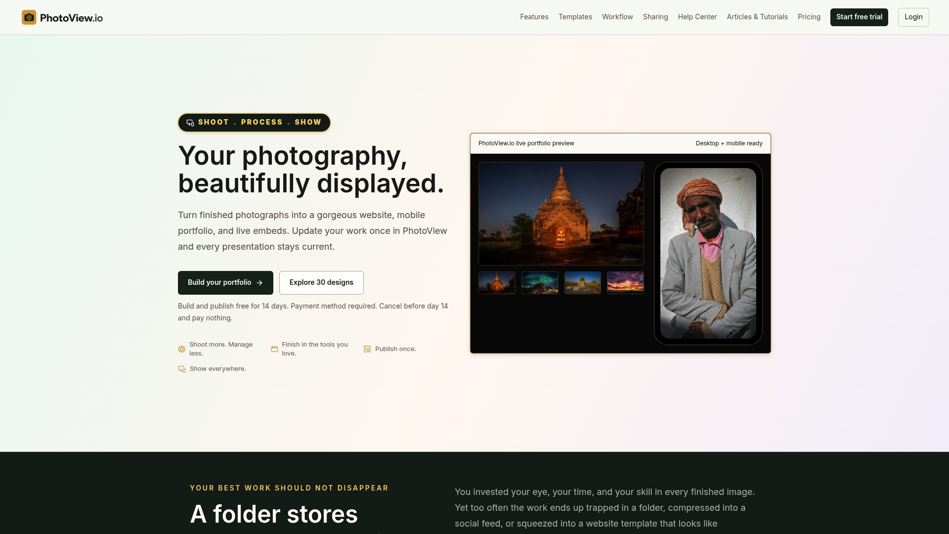
Stat to check yourself: PhotoView.io’s own positioning states that all templates are included in every plan, so a mobile-first layout isn’t an upsell, it’s the default.
For exact pricing details, please visit the platform’s website. For exact pricing details, please visit the platform’s website. For exact pricing details, please visit the platform’s website. For exact pricing details, please visit the platform’s website.
Look specifically at Lightroom publishing, the mobile-ready templates, and how fast a new gallery goes live after upload. Start a trial at Photoview and run the same ten-minute test described above before you commit.
FAQ
What makes a portfolio truly mobile-friendly?
A truly mobile-friendly portfolio reflows cleanly at a 320 CSS-pixel width, supports 200% text resize without breaking the layout, and avoids forcing horizontal scrolling, per W3C’s WCAG 2.2 mobile guidance. It also keeps contact options and project context easy to find without multiple taps.
How do I test a portfolio site on my phone before choosing it?
Run a short acceptance test: check portrait and landscape layouts, zoom text to 200%, try keyboard or screen reader navigation, and test the contact form, following the practical workflow The Crit outlines. Testing on a mid-range phone with a slower connection reveals problems a fast desktop preview will hide.
What’s the difference between a portfolio builder and an inspiration site?
A portfolio builder, like PhotoView.io, actually stores your images and publishes your live site, while inspiration sites such as Figma’s portfolio example library or Dribbble only showcase design ideas. You can borrow layout ideas from an inspiration site, but you publish and update your actual work through a builder.
Does PhotoView.io support publishing directly from Lightroom?
Yes, PhotoView.io offers Lightroom publishing so updates made in your catalog can push directly to your live portfolio without a manual re-upload. This keeps embedded galleries and mobile pages current with minimal extra work.
How much does PhotoView.io cost?
PhotoView.io’s Starter plan runs $3.99 per month or $39.99 per year, with Growth, Studio, and Premier plans scaling up from there based on storage needs, and a Custom plan available for high-volume users. Full pricing details are available at Photoview.
Sources
- Guidance on Applying WCAG 2.2 to Mobile Applications (WCAG2Mobile)
- Mobile Portfolio Design: Responsive Tasks, Content, and Testing | The Crit
- 13 Popular Photography Portfolio Sites Ranked from Best to Most Frustrating | PetaPixel
- 23 Inspiring Portfolio Website Examples & Tips | Figma