
Developer Checklist for Image First Photo Gallery Templates for Pros
Practical curation rules and a developer ready technical checklist for image first photo galleries. Compare tradeoffs and 30+ PhotoView.io templates to...

Developer Checklist for Image First Photo Gallery Templates for Pros
Choose image-first, responsive templates with accessible lightboxes over feature-heavy builders that bury your photos in navigation. The best templates prioritize modern formats, proper responsive delivery, and accessibility from the first line of code, not as an afterthought. If you want a production-ready starting point without wrestling with encoding pipelines yourself, PhotoView.io packages these principles into ready-to-use portfolio templates.
TL;DR:
- Choose templates with minimal design and full-bleed images that prioritize a clean, distraction-free viewing experience aligned with modern accessibility standards.
- Ensure the template supports AVIF as the primary format with WebP and JPEG fallbacks, and uses
srcsetandpictureelements for optimal responsive delivery.- Test lightboxes for keyboard navigation, focus return, and accessibility labels before committing to a template to avoid usability issues for all users.
- Match template styles to your project type, such as sliders for sequences or grids for variety, and customize color, typography, and layout for seamless integration with your brand identity.
- Prefer templates that are actively maintained, support easy updates, and integrate smoothly with your existing website platform or offer a standalone publishing solution.
PhotoViewPresent Your Work Beautifully EverywherePhotoView helps photographers organize, curate, and publish responsive portfolios, presentations, and galleries from one dashboard.Explore PhotoView
Table of Contents
- What makes a great photography gallery template
- Template styles and when to use each
- Technical checklist: formats, sizes, encoding, and responsive delivery
- How to test a template before you commit
- Connecting your gallery to WordPress, Squarespace, or a standalone site
- Making a template look like yours
- How often templates get updated and what support looks like
- Standout template options and their tradeoffs
- Where photographers get the balance wrong
- PhotoView.io: portfolio-first templates built to match this approach
- Sources
- FAQ
What makes a great photography gallery template
A gallery template earns the label “image-first” when its interface gets out of the way. Minimal chrome, generous white space, and full-bleed images let your work read like a curated exhibition rather than a marketing page. Everything else should serve that goal.
Responsive delivery matters as much as layout. A template worth using should support the srcset attribute and the picture element so it can serve different crops for portrait versus landscape orientations, an approach sometimes called art direction. According to an image optimization guide covering formats and delivery, serving AVIF first with WebP and JPEG fallbacks through the picture element preserves both quality and framing across devices.
Format strategy follows a clear hierarchy: AVIF as the primary format, WebP as the fallback, and JPEG as the final safety net for older browsers. PNG earns its place only for graphics with transparency, and SVG works for logos or vector overlays, never for photographs.
The lightbox is where judgment happens, so it needs to hold up under scrutiny. Caption handling, metadata display, and smooth transitions between images all affect how a client or curator experiences your edit. A photography portfolio optimization guide notes that optimized portfolios rely on multiple image sizes and sRGB color space, with much larger widths reserved for lightbox and detail views than for thumbnails.
Beyond visuals, look for:
- Keyboard controls and clear ARIA labeling on every lightbox control
- Lazy-loading rules that protect your hero image from load delays
- CDN-backed delivery to keep large galleries fast
- Lightroom publishing, custom domains, and private gallery options for real production use
Pro Tip: Test a template’s lightbox with your keyboard alone before you commit. If you can’t navigate it without a mouse, your clients might struggle too.
Template styles and when to use each
Different bodies of work call for different structures. Matching the template style to the story you’re telling matters more than picking the trendiest layout.
- Image-first sliders work best for a tight, sequenced edit, a wedding highlight reel or a single shoot you want viewed in order.
- Grid and masonry galleries suit browsable portfolios with mixed aspect ratios; look for templates that handle filtering and pagination without forcing every image into the same crop.
- Project pages or case studies give captions and sequence room to build a narrative, ideal for editorial or commercial work where context matters as much as the image.
- Client proofing templates need password protection, controlled downloads, watermarking, and noindex settings so proofs stay private until a client approves the final selects.
- Genre-specific choices follow naturally from these structures: wedding photographers often lean on sliders and proofing galleries, fine art photographers favor minimal grids, and commercial photographers benefit from project pages that pair images with copy.
A Swiper Studio template built for photographers demonstrates how a full-bleed slider with minimal chrome keeps attention on the images rather than the interface, a useful reference point when you’re comparing layout options.
Technical checklist: formats, sizes, encoding, and responsive delivery
Once you’ve picked a style, the technical details decide whether it actually performs. A template can look right in a demo and still fail once it’s loaded with your full-resolution work.
Start with format order: AVIF as the primary format, WebP as fallback, JPEG last. Reserve PNG for transparency needs and SVG for vector graphics only.
Baseline output sizes give you a starting point rather than a rule: thumbnails around 400 pixels wide, gallery views around 1,200 pixels, and lightbox or detail views around 2,400 pixels, scaled up further only for very large displays.

Encoding choices matter too. Progressive JPEG rendering, a quality setting between 75 and 85, and sensible chroma subsampling keep file sizes reasonable without visible quality loss.
For responsive delivery, the picture element paired with srcset lets you serve different crops for mobile and desktop, an approach an image optimization guide recommends specifically for art-directed photography. Preload your hero image and set fetchpriority="high" so it loads before anything else competes for bandwidth.
Lazy loading needs a firm rule: never lazy-load the hero or largest contentful paint image. According to guidance on lazy loading, applying loading="lazy" to that image causes significant delays to largest contentful paint, while everything below the fold can and should be lazy-loaded.
- Use a CDN with automatic image transforms to generate AVIF and WebP variants on the fly
- Confirm your template preloads the hero image rather than treating it like every other asset
- Check that gallery images below the fold carry
loading="lazy"by default - Verify quality settings land in the 75 to 85 range before publishing full galleries
How to test a template before you commit
A demo gallery can look polished and still fail once your full-resolution portfolio is loaded onto it. Run these checks before you build your real site on top of any template.
- Run Lighthouse or WebPageTest against the demo and confirm the largest contentful paint score reflects an eagerly loaded, preloaded hero image.
- Tab through the entire gallery using only your keyboard, checking that arrow keys move between images and Escape closes the lightbox.
- Confirm focus returns to the triggering thumbnail after closing the lightbox, a detail lightbox accessibility patterns identifies as essential for keyboard and screen reader users.
- Check that every lightbox control carries a clear programmatic label rather than relying on an icon alone.
- Load the gallery on a throttled mobile connection and watch whether portrait crops appear correctly through art direction.
- Tap through touch targets on a phone to confirm buttons are large enough to hit reliably.
- Run through a full proofing flow, if the template supports one, checking watermarks, download permissions, and privacy settings behave as expected.
Pro Tip: Keep a single test image with a busy background and a clear focal point. Run it through every template you’re evaluating so you’re comparing crops and compression fairly.
Connecting your gallery to WordPress, Squarespace, or a standalone site
Most photographers already have some kind of web presence, and how a gallery template fits into it shapes the decision as much as the design itself. WordPress users typically rely on plugins or theme-native galleries, which means checking a template’s compatibility with your specific theme before assuming it will slot in cleanly. Squarespace, by contrast, restricts customization to its own gallery blocks, so a template built outside that ecosystem usually needs to run as an embed rather than a native page.
Embedding is where a dedicated portfolio platform earns its keep. Rather than rebuilding a gallery every time you update your work, a live embed updates automatically wherever it’s placed, whether that’s a WordPress page, a Squarespace site, or a custom-built one. This matters most for photographers who maintain a presence across multiple platforms: a client-facing site, a personal blog, and a social profile all pulling from the same source of images.
If you’re building from scratch rather than integrating with an existing site, a standalone portfolio platform sidesteps CMS compatibility questions entirely. You publish once and the responsive delivery, format handling, and accessibility work happen behind the scenes, regardless of where the gallery ultimately lives.
Making a template look like yours
A template only works if it disappears into your visual identity rather than announcing itself as a template. The customization options worth prioritizing are the ones that shape mood without adding complexity: color schemes, layout density, and typography.
Color schemes should support your images rather than compete with them. Dark backgrounds tend to suit high-contrast or moody work, while lighter backgrounds often serve airy, high-key photography better. Layout density, meaning how many images appear per row and how much white space separates them, changes the pacing of how someone moves through your edit. A tighter grid reads as energetic; more breathing room reads as deliberate and editorial.
Typography gets less attention than it deserves. Captions and project titles set the tone for the entire site, and a template that limits you to one generic sans-serif font will flatten every portfolio into the same look. Look for templates that let you adjust font pairing, weight, and size without needing to touch code.
The best customization options are the ones you use once and forget about, not settings you have to revisit every time you add new work. A template that requires manual rebuilding each time you update your portfolio defeats the purpose of choosing a template in the first place.
How often templates get updated and what support looks like
Template quality isn’t fixed at launch. Browser support for image formats changes, accessibility standards get revised, and a template that was current two years ago may quietly fall behind on performance best practices. Before committing to a template, it’s worth checking how actively it’s maintained and what happens when something breaks.
Open-source and free templates, like the Lumen photography portfolio template, typically rely on community contributions for updates, which means fixes and format support can lag depending on how active the project is. That tradeoff is worth accepting for photographers comfortable troubleshooting code themselves, but it puts the maintenance burden on you.
Paid platforms generally offer a different arrangement: templates get updated centrally, and support comes from the platform itself rather than a community repository. That distinction matters most when a browser update changes how a format renders or when an accessibility standard shifts, since you won’t need to track those changes yourself or wait on a volunteer maintainer.
Whichever route you choose, ask directly how updates get communicated and whether older galleries get migrated automatically or require manual rework. A template that looks free today can cost real time later if every update means rebuilding your site from scratch.

Standout template options and their tradeoffs
A few templates illustrate the range of choices available, each with a clear tradeoff worth weighing before you commit.
Minimal slider templates, like the image-first template from Swiper Studio, strip away nearly all interface elements in favor of full-bleed images and simple navigation. The tradeoff is flexibility: these templates suit a tightly curated edit but struggle with large, mixed-ratio bodies of work.
Open-source portfolio templates such as Lumen offer full control over code and no licensing cost, which appeals to photographers who want to customize every detail. The tradeoff is maintenance: you’re responsible for keeping formats, accessibility, and performance current yourself, without a support team to lean on.
Grid and masonry templates handle variety well, mixing portrait and landscape images without forcing uniform crops, and they tend to scale better for large portfolios. Their tradeoff is that a busy grid can undercut the sequencing a slider provides, so a project meant to be viewed in order can lose its narrative structure.
Platform-based templates, including PhotoView.io’s collection, bundle responsive delivery, Lightroom publishing, and accessibility handling into a single subscription, removing the technical setup entirely. The tradeoff, as with any subscription tool, is an ongoing cost rather than a one-time build, though for many photographers that cost buys back the time otherwise spent maintaining code.
Where photographers get the balance wrong
Most photographers overinvest in template features and underinvest in the edit itself. A gallery with fifteen perfect images in the right sequence beats a gallery with sixty images and a dozen customization options nobody notices. The 20-60-20 heuristic is a useful planning tool here: spend the bulk of your effort on selecting and sequencing images, and treat layout and feature comparisons as the smaller bookends around that work.
Correct formats and responsive art direction do more for how your portfolio feels than any slider animation or filter option. A tight edit displayed correctly will always outperform a sprawling one buried under features. Before you publish anything, check your color in sRGB and view the result on at least two different displays. Colors that look right on a calibrated monitor can shift noticeably on a phone screen, and that gap is often the last thing photographers check.
— Mitch Russo
PhotoView.io: portfolio-first templates built to match this approach
If the checklist above sounds like more setup than you want to manage yourself, consider using photography SEO services tailored for photographers that help increase discoverability while you focus on your craft. Update your work once, and it presents consistently across your website, mobile devices, and any embed, without rebuilding templates every time your portfolio changes.
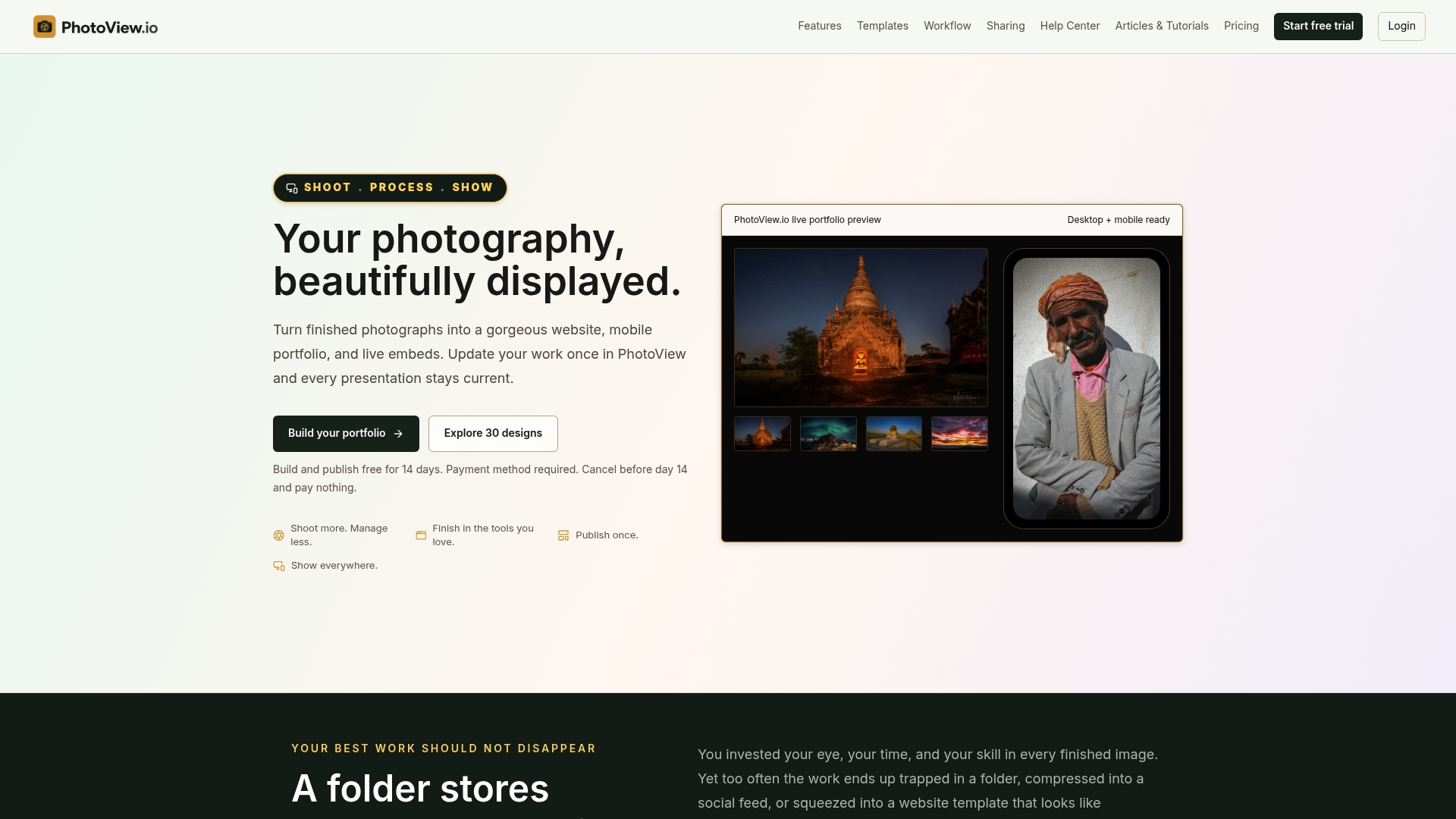
The platform includes:
- 30+ responsive templates covering sliders, grids, and project-page layouts
- Direct Lightroom publishing so finished edits move straight to your site
- Smart Folders for organizing large or mixed-media libraries
- Custom domains, private galleries, and live embeds that stay current from one dashboard
This fits portfolio-first professionals, travel, fine art, wedding, and commercial photographers, who want centralized publishing rather than juggling separate tools for storage, proofing, and display. Browse the photography website templates to see the layouts in action, or explore the portfolio publishing solutions built around this workflow. PhotoView.io offers various subscription plans starting at lower monthly fees, with all plans including access to the full template library. Visit their website for current pricing details.
Sources
- Photography portfolio optimization guide
- Lightbox accessibility patterns
- Image optimization guide: formats, responsive images, delivery
- Lazy loading done right
FAQ
What is the best website template for a photo gallery?
The best template is image-first, with minimal chrome, responsive srcset delivery, and an accessible keyboard-friendly lightbox. Beyond that baseline, the right choice depends on whether you need a slider for a sequenced edit, a grid for browsable variety, or a proofing template for client work.
What is the 20-60-20 rule in photography?
Applied to a portfolio, it means spending most of your time on selecting and sequencing images rather than tweaking template features.
What are the best photo editing templates?
Editing templates, like Lightroom presets, are a separate tool from gallery templates, which handle how finished images are displayed rather than edited. For display, look for templates that support Lightroom publishing directly, so your edited work moves to your site without an extra export step.
How do I create a photography gallery?
Start by curating a tight edit, then choose a template style, slider, grid, or project page, that matches how you want that edit experienced. From there, confirm the template handles responsive formats and accessibility correctly, either by building it yourself following a technical checklist or using a platform like Photoview that handle those details automatically.