
One Weekend to Ship a Photography Portfolio Homepage Photographers Need
Curated homepage patterns and PhotoView templates with step by step tasks to launch or fix your photography portfolio homepage in a weekend.
One Weekend to Ship a Photography Portfolio Homepage Photographers Need
Your homepage has one job: prove you can make images worth paying for, then make it effortless to hire you. Pick your three strongest photos for the top of the page and put a contact link where no one has to hunt for it. A platform like Photoview handles the template and publishing side, so you can focus on those two decisions instead of fighting a website builder.
TL;DR:
- Show your three strongest images immediately, keeping the grid consistent and curated to avoid clutter and overwhelm visitors.
- Include a clear headline, value proposition, and contact method in the hero section for quick understanding and easy outreach.
- Use fast-loading, modern image formats with lazy loading and compression to ensure mobile visitors see your work promptly within 2.5 seconds.
- Keep your homepage layout simple, emphasizing your best work with proper image scale, whitespace, and minimal typography for visual hierarchy.
- Regularly update your hero image and galleries quarterly, testing different elements to enhance engagement and prevent the site from appearing inactive.
Table of Contents
- Photography Portfolio Homepage Examples Worth Copying
- The Homepage Elements Every Portfolio Needs
- Layout, Navigation, and Visual Identity That Keep Visitors Engaged
- Choosing and Preparing Images for the Homepage
- Mobile Performance and SEO Basics for a Portfolio Homepage
- From Launch to Living Portfolio: A Practical Checklist
- Why PhotoView.io Fits the Homepage Needs Above
- What I’d Do With Only One Weekend to Fix My Homepage
- Build Your Homepage Without the Website Headache
- Sources
- FAQ
Photography Portfolio Homepage Examples Worth Copying
You don’t need to reinvent your layout. You need to recognize which proven pattern fits your work, then borrow its best idea. Figma’s roundup of portfolio sites makes a point worth repeating: a portfolio works best when it reads as a professional identity, not a generic gallery of samples. The patterns below all achieve that in different ways.
- Gallery-first grid. The homepage opens straight into a tight image grid, usually nine to twelve photos, with almost no text above it. This works when your images do the talking better than any headline could. Steal this: keep the grid to one consistent aspect ratio so the page feels curated instead of cluttered.
- Editorial project spotlight. Instead of a grid, the homepage features one recent project with a short narrative, styled like a magazine spread. Wedding and documentary photographers use this often because it shows storytelling range, not just single frames. Steal this: cap the project text at two or three sentences so it reads as a caption, not a blog post.
- Contact-first layout. The hero section pairs a strong image with a booking link or contact form, visible without scrolling. Portfolios like Nicholas Dvorak’s put a selective gallery and contact method front and center rather than burying them in a menu. Steal this: treat your contact method as part of the hero design, not an afterthought in the footer.
- Mixed-media homepage. Stills and short video clips sit in the same grid, often with motion previews on hover. Commercial and product photographers use this to prove they can deliver more than one format to agencies who need both. Steal this: keep video clips under ten seconds so the page still loads fast.
- Video-led hero. A full-width video reel or cinemagraph runs behind the headline, replacing a static hero image. This suits motion-forward photographers and videographers who want the homepage itself to demonstrate craft. Steal this: always include a poster image fallback so mobile visitors on slow connections still see something immediately.
- Single-project focus. The entire homepage is built around one signature body of work, with everything else tucked behind a “more work” link. Fine art and conceptual photographers lean on this to make a specific statement rather than a broad résumé. Steal this: let the project title double as your value proposition instead of writing a separate tagline.
- Categorized landing. The homepage acts as a directory: a few large tiles link out to “Weddings,” “Portraits,” “Commercial,” and so on. This fits photographers who shoot across genres and want visitors to self-select fast. Steal this: use one representative image per category tile rather than a text label alone, so the tile itself sells the category.
Portfolios like Juno Kim’s show how much these patterns can vary once you adapt them to your own niche rather than copying a template wholesale. Awwwards’ portfolio collection reinforces the same idea: the sites that rank highest all pair a clear value proposition with a visual showcase built for quick scanning, not deep reading.
If you want a deeper library of homepage layouts organized by genre, PhotoView’s guide to photography portfolio examples is worth a slow scroll before you start designing.
The Homepage Elements Every Portfolio Needs
Every pattern above still relies on the same four building blocks. Get these right and the layout choice becomes secondary.
- The hero section. This is everything visible before a visitor scrolls: a headline, a subheadline, a primary call to action, and one supporting image or video. The headline should name what you shoot and for whom, not just your name in large type. “Wedding photography for couples who skip the posed shots” tells a visitor more in five seconds than “Jane Doe Photography” ever will.
- The value proposition. This is one sentence, usually the subheadline, that separates you from every other photographer with a camera and a website. Three templates that work across genres: “[Specialty] photography that feels like [emotional outcome],” “Helping [client type] get [specific result] through photography,” or simply naming your process (“Film-first portrait sessions, shot on location”). Avoid adjectives like “passionate” or “creative.” Every photographer claims those; none of them mean anything to a visitor comparing five sites in ten minutes.
- Calls to action. You need a primary CTA (book a call, request a quote, view pricing) placed in the hero, and often a secondary CTA (see full portfolio, view a specific gallery) placed just below it. A sticky header button that stays visible as visitors scroll through your grid removes the need for them to scroll back to the top when they’re ready to reach out. One Page Love’s analysis of portfolio landing pages lists a clear call to action as one of the handful of elements that consistently separates sites that convert from sites that just look nice.
- Contact visibility. A visitor shouldn’t have to click into a separate “Contact” page to find out how to reach you — a short form, a booking calendar link, or even a visible email address in the header does the job. Tools like Konvuno’s conversational booking and inquiry platform make this process effortless for both visitors and photographers. A short form, a booking calendar link, or even a visible email address in the header does the job. Some of the strongest-performing portfolio homepages treat a contact-first CTA as a persistent element rather than something buried at the bottom of the page, precisely because gallery browsing alone rarely converts a visitor into a client.
Pro Tip: Test your contact method on your own phone before launch. If it takes more than two taps to reach a form or a calendar link, a visitor on a spotty connection at a coffee shop will bounce before they get there.
Layout, Navigation, and Visual Identity That Keep Visitors Engaged
The layout choice that matters most isn’t grid versus editorial. It’s how much you reveal at once.
Progressive disclosure means showing a small curated teaser on the homepage, letting visitors click into categories, then into full project pages, rather than dumping your entire catalog above the fold. This structure keeps the homepage light and fast while still giving deeply interested visitors a path to see more. Skipping this step and showing everything at once is the fastest way to overwhelm a first-time visitor and lose them before they scroll past your third image.
Deciding between a single-page and a multi-page structure comes down to how much work you want to show. A single-page homepage that scrolls through a curated set of images works well for photographers with a tight, consistent body of work, portrait and product photographers especially. A multi-page structure, where the homepage teases and separate pages hold full galleries, suits photographers with more range: wedding, travel, and commercial shooters who need to organize by category without cramming it all into one scroll.
Visual hierarchy comes down to three controllable choices:
- Image scale. Your strongest image should be the largest element on the page, not competing for attention with five other same-sized thumbnails.
- Whitespace. Margins and gaps between images aren’t wasted space. They’re what makes a grid feel curated instead of cluttered.
- Typography. Two typefaces, at most. One for headlines, one for body text. Anything more starts to compete visually with the photos, which should always win that competition.
Branding on a homepage isn’t a logo. It’s consistency. The same crop ratio across your grid, a color grade that holds steady from image to image, and a written voice that doesn’t swing from formal in your About section to casual in your captions. A visitor scrolling through inconsistent edits reads it as a lack of a defined style, even if every individual photo is technically excellent.
Choosing and Preparing Images for the Homepage
The images you pick matter more than the template they sit in. Selection comes down to three filters: does this photo match what your ideal client is searching for, is the technical quality strong enough to hold up at full screen width, and does this image sit next to its neighbors in a way that tells a coherent story rather than a random highlight reel.
Technical prep is worth getting exact:
- Format: Use JPEG for photos (with WebP as a modern fallback where your platform supports it) rather than uncompressed TIFF or PNG, which slow load times without a visible quality gain on screen.
- Hero resolution: Aim for roughly 2,000 to 2,500 pixels on the long edge for a full-width hero image, large enough for retina displays without bloating file size.
- Grid resolution: Thumbnail and grid images can run smaller, generally 1,000 to 1,200 pixels on the long edge, since they display at a fraction of hero size.
- Crop ratios: Keep hero images close to 16:9 or 3:2 for wide-screen impact, and standardize grid images to a single ratio (square or 4:5 works well) so the layout reads as intentional.
Sequencing matters as much as selection. Open with your strongest, most recognizable image. Follow with variety, a mix of subjects or moods, rather than five nearly identical frames in a row. Close a scroll sequence on a second strong image, since visitors often remember the first and last thing they saw far more than the middle.
One Page Love’s structural analysis of high-converting portfolio landing pages notes that scannable, above-the-fold value communication consistently outperforms pages that ask visitors to scroll extensively before understanding what they’re looking at.
Don’t skip alt text. Every hero and grid image needs a short, specific description, “bride and groom laughing during golden hour reception,” not “photo1.jpg,” both for accessibility and for search visibility.
Mobile Performance and SEO Basics for a Portfolio Homepage
More than half your visitors will land on your homepage from a phone, often clicking through from Instagram or a Google search on the go. A homepage that loads slowly or breaks on a small screen loses the client before they see a single photo.
Mobile-first thinking starts with your gallery breakpoints. A grid that shows four columns on desktop should collapse to two or even one column on a phone screen, with images resized rather than simply shrunk. Test your homepage at 375 pixels wide, roughly the width of a standard phone screen, and check that no image gets cropped awkwardly or text overlaps a photo.
On image delivery, three habits matter:
- Modern formats and srcset. Serve WebP images with a srcset attribute so browsers load the right size for each device instead of downloading a desktop-sized file on a phone.
- Lazy loading. Images below the fold should load only as a visitor scrolls to them, not all at once on page load.
- Compression without visible loss. Most photo-heavy homepages can cut file size by 40 to 60 percent through compression before a viewer notices any quality difference.
Two performance metrics are worth checking in Google’s PageSpeed Insights or a similar tool: First Contentful Paint, how quickly the first visible element appears, and Largest Contentful Paint, how quickly your biggest element, usually the hero image, finishes loading. Aim for both under 2.5 seconds on mobile.
For SEO, keep it simple: a descriptive page title that names your specialty and location, one H1 that matches what you actually shoot, alt text on every image, and a meta description that reads like a value proposition rather than a keyword list. Lapa Ninja’s review of high-converting portfolio landing pages points to the same combination: fast load times and scannable content consistently outperform visually dense pages that take longer to parse.
From Launch to Living Portfolio: A Practical Checklist
A homepage doesn’t need to be perfect to launch. It needs the essentials in place and a plan to keep improving after that.
- Confirm the minimum launch checklist. Hero image and headline, a one-sentence value proposition, a primary CTA, a visible contact method, and analytics tracking installed. If any of these five is missing, the homepage isn’t ready.
- Set an update cadence. Swap your hero image and refresh at least one gallery every quarter, more often if you shoot seasonal work like weddings or events. A stale homepage signals an inactive photographer even if you’re busier than ever.
- Run small tests. Try two different hero images for a month and watch which one keeps visitors on the page longer. Try rewording your CTA button from “Contact Me” to “Check Availability” and see if inquiries shift.
Pro Tip: Check your analytics for scroll depth, not just page views. If most visitors never scroll past your hero section, the problem isn’t your gallery. It’s that nothing above the fold is giving them a reason to keep going.
Track qualitative feedback too. Ask new clients how they found you and what almost stopped them from reaching out. That answer, more than any dashboard, tells you what to fix next.
Treating your homepage as a living document rather than a finished project pays off. Add a one-line case study blurb under a recent gallery, “Shot for a Denver-based restaurant’s spring menu launch,” and you turn a static image into proof of results, not just aesthetics.
Why PhotoView.io Fits the Homepage Needs Above
Every element covered so far maps directly onto features PhotoView was built around, which is why it’s worth understanding the fit rather than treating this as a generic tool recommendation.
- Templates handle hero and layout decisions. With more than 30 responsive templates, you can match your homepage to gallery-first, editorial, or contact-first patterns without hand-coding a layout.
- Lightroom publishing keeps the update cadence realistic. Publishing straight from Lightroom means a quarterly refresh takes minutes instead of a re-export and re-upload cycle.
- Smart Folders solve project organization. Instead of manually rebuilding galleries, Smart Folders keep your homepage’s categorized sections synced to how you already organize work in your catalog.
A photographer who spends a Saturday afternoon picking a template, dragging in a Smart Folder of recent work, and connecting a custom domain can have a functioning, mobile-ready homepage live before dinner, no developer required.
For photographers who publish directly from Lightroom, PhotoView’s Lightroom to online portfolio workflow guide walks through the exact publishing steps, and the platform solutions page lays out how templates, Smart Folders, and private sharing work together on one dashboard.
What I’d Do With Only One Weekend to Fix My Homepage
Most photographers over-plan their homepage redesign and never ship it. If you only have one weekend, don’t try to perfect everything. Sequence it.
Saturday morning: pick your three strongest images and write a one-sentence value proposition. That’s it. Two hours, maximum. Saturday afternoon: choose a template that matches one of the patterns covered earlier and drop those images in, with your contact method placed in the hero, not the footer. Sunday: test on your phone, fix anything that breaks, and publish.
Before you launch, check three things only: does the hero load in under three seconds on mobile, is the contact method reachable in one tap, and does the headline say what you shoot rather than just your name. Everything else, from A/B testing hero images to writing case-study blurbs, can wait until week two. Templates exist precisely so this weekend timeline is realistic instead of aspirational.
— Mitch Russo
Build Your Homepage Without the Website Headache
If everything above sounds right but building it from scratch still feels like the hard part, that’s exactly the gap PhotoView closes. Instead of hiring a developer or wrestling with a generic website builder that wasn’t built for photo-heavy pages, you pick a template designed specifically for portfolio homepages, publish straight from Lightroom, and keep everything organized through Smart Folders instead of manual uploads.
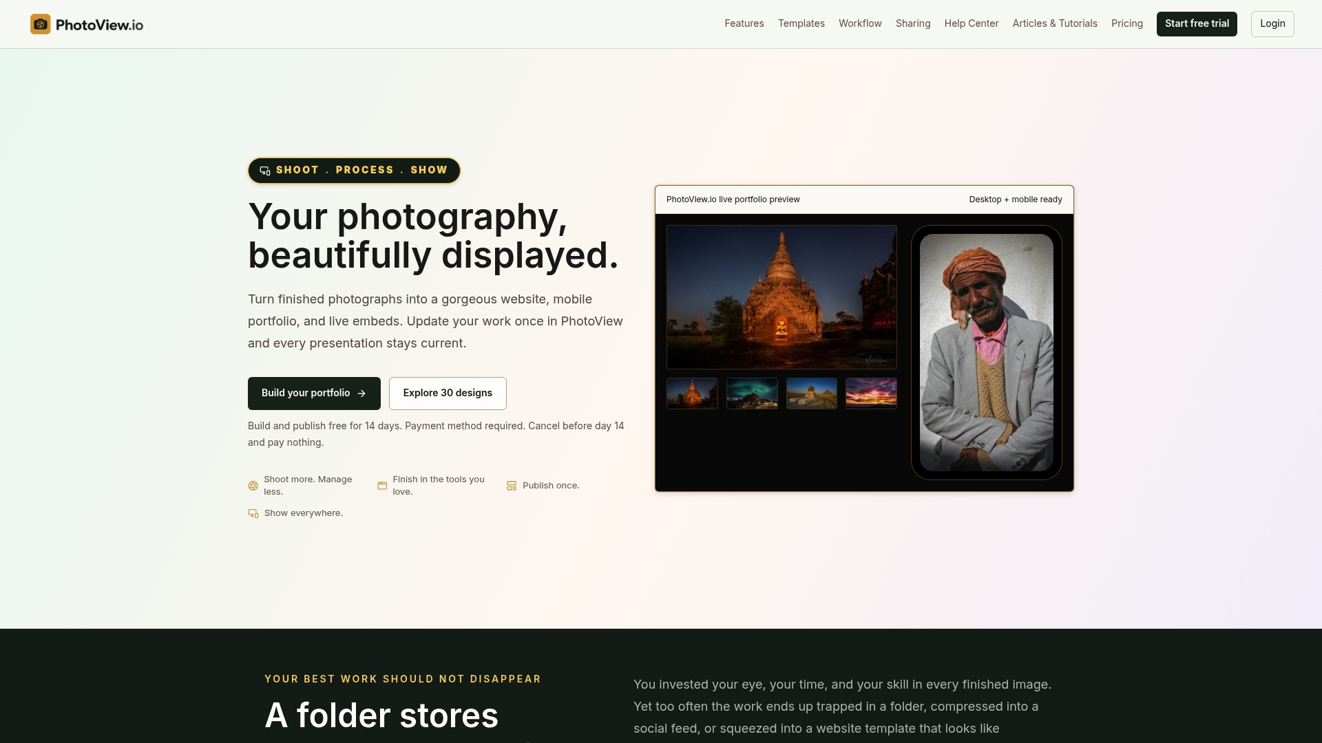
That means the hero, the gallery grid, the mobile responsiveness, and the contact CTA covered in this article come built in rather than something you have to code from zero. Browse the photography website templates to find a layout that matches your genre, then start a trial and have a working homepage live before the weekend is over.
Sources
- 23 Inspiring Portfolio Website Examples & Tips | Figma
- Best Portfolio Websites | Web Design Inspiration
- Portfolio Website Design Inspiration
- Portfolio Landing Pages: 1067 Creative Examples | Lapa Ninja
FAQ
What should be on a photography portfolio homepage above the fold?
A strong hero image, a headline naming your specialty, a one-sentence value proposition, and a visible primary call to action, ideally all visible without scrolling.
How many images should a portfolio homepage show?
Start with a curated teaser of nine to twelve strong images rather than your entire catalog. Progressive disclosure keeps the homepage fast and lets interested visitors click deeper into full galleries.
Should my portfolio homepage be one page or multiple pages?
A single-page structure suits photographers with a tight, consistent body of work, while a multi-page structure fits photographers shooting across several categories who need dedicated project pages.
What is the fastest way to build a photography portfolio homepage?
Choosing a template built for photography, like the responsive options available through PhotoView, lets you publish a mobile-ready homepage in an afternoon without custom development.
How often should I update my portfolio homepage?
Refresh your hero image and at least one gallery every quarter, or more often if you shoot seasonal work, since a static homepage signals inactivity even when your business is busy.