
Fast mobile photography portfolios for photographers with srcset and AVIF
Practical photographer-first steps to pick responsive templates, test on real phones, and apply srcset, picture elements, and AVIF so portfolios load fast...

Fast mobile photography portfolios for photographers with srcset and AVIF
The fastest way to get a truly responsive photography portfolio is to choose a photographer-focused platform that pairs responsive templates with modern image delivery and an easy update workflow. That combination gives you device-consistent presentation, fast-loading galleries, and a routine for keeping your work current. Photoview is built around this exact approach, though whatever you choose, test it on a real phone before you trust it with client work.
TL;DR:
- Match the grid to your genre, then test swipe navigation, zoom, and scroll position on a real phone using your largest gallery before committing.
- Serve AVIF first, with WebP and JPEG fallbacks, and use responsive image sizing; thumbnails need 400 by 400 pixels at about 80% quality.
- Load the first six to eight gallery images eagerly, lazy load those below the fold, and add image dimensions to prevent page shifts.
- PhotoView charges $3.99 monthly or $39.99 yearly for Starter; all tiers include templates and workflow tools, while higher tiers mainly add storage.
- Refresh your lead project every few weeks and check quarterly that original files are backed up outside the platform in a separate location.
PhotoViewPresent Your Portfolio Beautifully on MobilePhotoView brings responsive portfolio templates, mobile-ready presentations, and live website embeds together in one dashboard for photographers.Explore PhotoView
Table of Contents
- What responsive photography templates do and which features to prioritize
- Design and UX best practices for responsive photography portfolios
- Image optimization and responsive images for photography portfolios
- Practical setup and maintenance workflow for a responsive portfolio
- Publisher perspective: building portfolios that hold up under real use
- Pricing models and subscription plans for responsive portfolio platforms
- Criteria for choosing a responsive photography portfolio provider
- Questions to ask before selecting a portfolio platform
- Common red flags when choosing a responsive portfolio service
- What actually separates a good portfolio from a forgettable one
- Try a responsive template built for exactly this workflow
- FAQ
- Sources
What responsive photography templates do and which features to prioritize
A responsive template reflows your grid based on screen size, but not all grids behave the same way once they hit a phone. Masonry grids stack unevenly sized images into tight columns, which suits documentary or street work where variety matters more than order. Justified grids keep rows aligned and feel more controlled, a natural fit for weddings and portraits. Full-bleed and full-screen layouts remove the frame entirely, letting single images command the viewport, which works well for fine art and travel portfolios where scale carries the mood.
Grid type is only half the evaluation. Watch how the lightbox handles touch: does a swipe move cleanly between images, or does it fight your finger? Does pinch-to-zoom work without breaking the layout? When you tap back to the grid, does the page remember your scroll position or dump you at the top?
Beyond interaction, check the controls that affect your actual editing workflow:
- Art-direction support so you can specify different crops for mobile and desktop instead of letting the browser squeeze a landscape shot into a square.
- Caption placement that stays legible on small screens without covering the image.
- Project grouping that lets you organize by shoot, client, or genre.
- Privacy options for password-protected galleries you share with clients before a project goes public.
Before committing to a template, run it through a short mobile checklist: rotate the phone between portrait and landscape, swipe through a full gallery, pinch to zoom on at least one image, and confirm the grid remembers where you left off when you back out.
Pro Tip: Demo a template with your heaviest gallery, not your lightest. Grids that look clean with ten images sometimes stutter at eighty.
Design and UX best practices for responsive photography portfolios
Your images are the product, so the interface around them should disappear. Minimal chrome, generous negative space, and restrained typography keep attention on the photograph rather than the navigation.
Aspect ratio consistency matters more than it seems. A uniform grid of 4:5 crops reads as intentional and calm, while a mix of orientations without any guiding rule can look chaotic on mobile, where screen width is tight. That said, consistency should not override composition: for hero images or opening spreads, using a <picture> element to serve an art-directed crop (tighter and more vertical on mobile, wider on desktop) preserves the shot’s intent at every width, which the Webvitals describes as a core use of picture for photographers.
Project structure should reduce friction for the people viewing your work, often clients who are not browsing for fun. Clear entry points by category, a visible way back to the main grid, and predictable navigation between projects all matter more than clever transitions.
A few accessibility basics round this out:
- Add alt text to every image, both for screen readers and for search visibility.
- Make sure lightbox controls (next, previous, close) are reachable by keyboard, not just touch or mouse.
- Keep focus states visible so keyboard users can tell where they are on the page.
None of this requires sacrificing style. It requires deciding, deliberately, where the interface should stay quiet.
Image optimization and responsive images for photography portfolios
This is the part most template marketing pages skip, and it is where a portfolio either feels instant or feels like a slideshow loading one frame at a time.
The srcset and sizes attributes tell the browser which image file to request based on the actual rendered size, not the device’s full screen width. For a full-width hero image capped at 1280 pixels, the Webvitals recommends a sizes value similar to (max-width: 1280px) 100vw, 1280px to let the browser pick an appropriately sized candidate from your srcset list instead of downloading the largest file every time.
Format strategy follows a clear fallback chain:
- Serve AVIF first, since it commonly saves a significant percentage in file size over JPEG at equivalent quality, according to Webvitals.
- Fall back to WebP for browsers that do not support AVIF.
- Keep a JPEG fallback for full compatibility.
- Export in sRGB for web delivery, which the ImageGuide photography portfolio guide recommends preserving color accuracy across devices.
Quality targets differ by use case, and treating every image the same wastes bandwidth on thumbnails while under-serving full views:
| Use case | Recommended dimensions | Recommended quality |
|---|---|---|
| Thumbnail | 400 by 400 pixels | Around 80% |
| Preview | 1200 by 800 pixels | Around 85% |
| Full view | 2400 by 1600 pixels | Around 90% |
These figures come from ImageGuide’s export presets for photography-specific delivery, which call for more conservative compression than general web images to protect tonal detail.
For performance-critical pages, a few rules make the biggest difference. Preload your largest contentful paint image with a matching imagesrcset and imagesizes entry, and set fetchpriority="high" on that same image so the browser fetches it before anything else. Eager-load the first six to eight images in a gallery, the ones visible on load, and lazy-load everything below the fold, a pattern ImageGuide recommends alongside blur-up placeholders for perceived speed. Always include width and height attributes on every image tag to prevent layout shift while files load.
Rather than exporting and storing every size and format by hand, a CDN image transform service such as Cloudinary, Imgix, or Cloudflare Images generates AVIF, WebP, and JPEG variants on demand and applies resizing rules at the point of delivery, which the Webvitals points to as the more sustainable production approach. A partner technical guide on ecommerce image optimization covers similar CDN-driven delivery patterns if you want a deeper look at performance engineering beyond photography specifically.

Practical setup and maintenance workflow for a responsive portfolio
Getting a portfolio live is one task. Keeping it current is the one that actually matters for bookings.
- Pick a template and run the mobile checklist described earlier before committing, since a template that looks right on your laptop can behave differently on a phone.
- Organize your images before you import them: consistent file naming and descriptive captions help both viewers and search engines find your work later.
- Publish directly from Lightroom when your workflow allows it, or import from your phone’s camera roll for work shot and edited on mobile.
- Connect a custom domain so your portfolio carries your own name rather than a platform subdomain.
- Set up password-protected galleries for client previews before a shoot goes public.
- Embed a live gallery on an existing website if you already have one and want updated work to appear there automatically.
A mobile import workflow built around moving images straight from your phone into a curated set of galleries removes one of the more tedious steps in this chain, especially for travel or event photographers shooting on location.
Pro Tip: Set a recurring reminder, monthly or after every major shoot, to rotate your front-page projects. A portfolio that never changes reads as inactive even when you are busy.
For maintenance cadence, aim to refresh your lead project every few weeks and do a full backup check quarterly, confirming your source files are stored somewhere beyond the platform itself.
Publisher perspective: building portfolios that hold up under real use
Years spent shooting and publishing work across travel, commercial, and portrait projects teach you one thing fast: a beautiful launch day means nothing if updating the site later becomes a chore. Maintainable templates matter more than impressive ones.
That is a problem some photography platforms aim to solve with their feature sets.
- Multiple responsive portfolio templates covering a range of genres and layout styles.
- Lightroom publishing alongside mobile import, so updates do not require a separate export step.
- Custom domains, private sharing, and live embeds that stay current from a single dashboard.
Mapped against the checklist in this article, template variety covers genre fit, Lightroom and mobile import cover workflow, and live embeds cover the maintenance problem that causes most portfolios to go stale. If you want to see how the pieces fit together, the best photo gallery platform overview walks through the reasoning behind a portfolio-first approach.
Pricing models and subscription plans for responsive portfolio platforms
Most responsive portfolio platforms charge a recurring subscription rather than a one-time fee, and the tiers usually scale with storage volume rather than feature access. That structure matters because a photographer shooting weddings or travel work accumulates far more image and video volume than someone updating a lighter personal site once a season.
PhotoView.io follows that model with five tiers. The Starter plan runs $3.99 per month or $39.99 per year, suited to photographers with a smaller active archive. Growth steps up to $5.99 per month or $59.99 per year, and Studio runs $7.99 per month or $79.99 per year for photographers managing multiple active projects. Premier, at $11.99 per month or $119.99 per year, suits high-volume shooters, and a Custom plan is available for storage needs beyond the standard tiers, with pricing available on request.
Every tier includes the full template library and workflow tools rather than gating features behind higher prices, which simplifies comparison: the decision comes down to how much you need to store, not which features you can afford to lose.
Annual billing consistently costs less per month than paying monthly across every tier, so if you know you are committing to a platform for the year, the annual rate is worth checking before you subscribe.

Criteria for choosing a responsive photography portfolio provider
Start with templates that fit your genre, since a layout built for weddings rarely flatters fine art or product photography. Beyond genre fit, a few criteria separate a platform worth committing to from one you will outgrow in a year.
Check how images are actually delivered. A platform that still serves uncompressed JPEGs at every screen size will load slowly regardless of how clean the template looks. Ask whether the service handles responsive image delivery and modern formats automatically, or whether that work falls on you.
Look at the update workflow next. If publishing a new project means manually resizing and uploading dozens of files every time, you will update less often than you intend. Platforms with Lightroom publishing or mobile import remove that friction directly.
Confirm ownership basics: can you connect a custom domain, export your images if you leave, and control privacy on a per-gallery basis for client previews. These are easy to overlook during a demo and expensive to discover missing later.
Finally, weigh storage against your actual shooting volume. A platform priced for a handful of galleries will not serve a working photographer adding hundreds of images a month, so match the plan to your real archive size rather than your current, possibly underbuilt, website.
Questions to ask before selecting a portfolio platform
A short list of direct questions during a demo saves you from discovering limitations after you have already imported a year of work.
Ask whether the platform supports direct publishing from Lightroom or only manual uploads, since that single detail determines how often you will realistically update your site. Ask how many templates are included at your plan level, and whether switching templates later preserves your existing galleries and captions.
Ask what image formats and sizes the platform generates automatically, since a service that handles AVIF and WebP delivery for you removes a technical burden you would otherwise hand to a developer. Ask about storage limits specifically, not just plan names, since “Growth” or “Studio” labels mean little without a clear gigabyte or terabyte figure attached.
Ask whether custom domains and private, password-protected galleries are included or cost extra. Ask what happens to your images and site if you cancel: can you export everything, or does your portfolio simply disappear.
If you are also handling your own technical implementation rather than using a managed platform, a developer-focused partner resource can help with custom responsive image work beyond what a template editor exposes.
Common red flags when choosing a responsive portfolio service
A few warning signs tend to predict frustration down the line. A platform that only shows desktop previews during the demo, with no way to test the mobile experience before you commit, is worth treating with suspicion since mobile is where most portfolios are actually viewed.
Watch for vague storage terms. “Unlimited” storage paired with throttled upload speeds or compressed image quality at higher volumes is a common bait-and-switch in this category. Ask for specifics rather than accepting the word at face value.
A template library that looks large but repeats the same layout with different color schemes is another sign, since genuine template variety should change grid structure, navigation, and crop handling, not just palette.
Be cautious of platforms that lock custom domains or private galleries behind their highest tier, since these are baseline professional features, not premium extras. And if a platform cannot explain, even in general terms, how it handles responsive image delivery, assume it is serving one oversized file to every device and your mobile visitors are paying the price in load time.
What actually separates a good portfolio from a forgettable one
The conventional advice tells you to find a beautiful template and stop there. That advice is incomplete. A gorgeous template serving unoptimized full-resolution JPEGs to every visitor will load slowly on mobile data, and slow load times undo whatever visual impression the layout was built to create.
The overrated part of portfolio selection is template aesthetics in isolation. Every reputable platform now offers attractive layouts; the differentiator has moved to how images are delivered and how easily you keep the work current. A photographer who updates their site twice a year with a mediocre template will usually out-book one who never touches a beautiful one.
Prioritize, in order: a workflow you will actually use to keep the portfolio fresh, image delivery that does not punish mobile visitors, and only then, template style. Get those first two right and the aesthetics mostly take care of themselves, because a fast, current, well-organized portfolio looks professional even in a modest template.
— Mitch Russo
Try a responsive template built for exactly this workflow
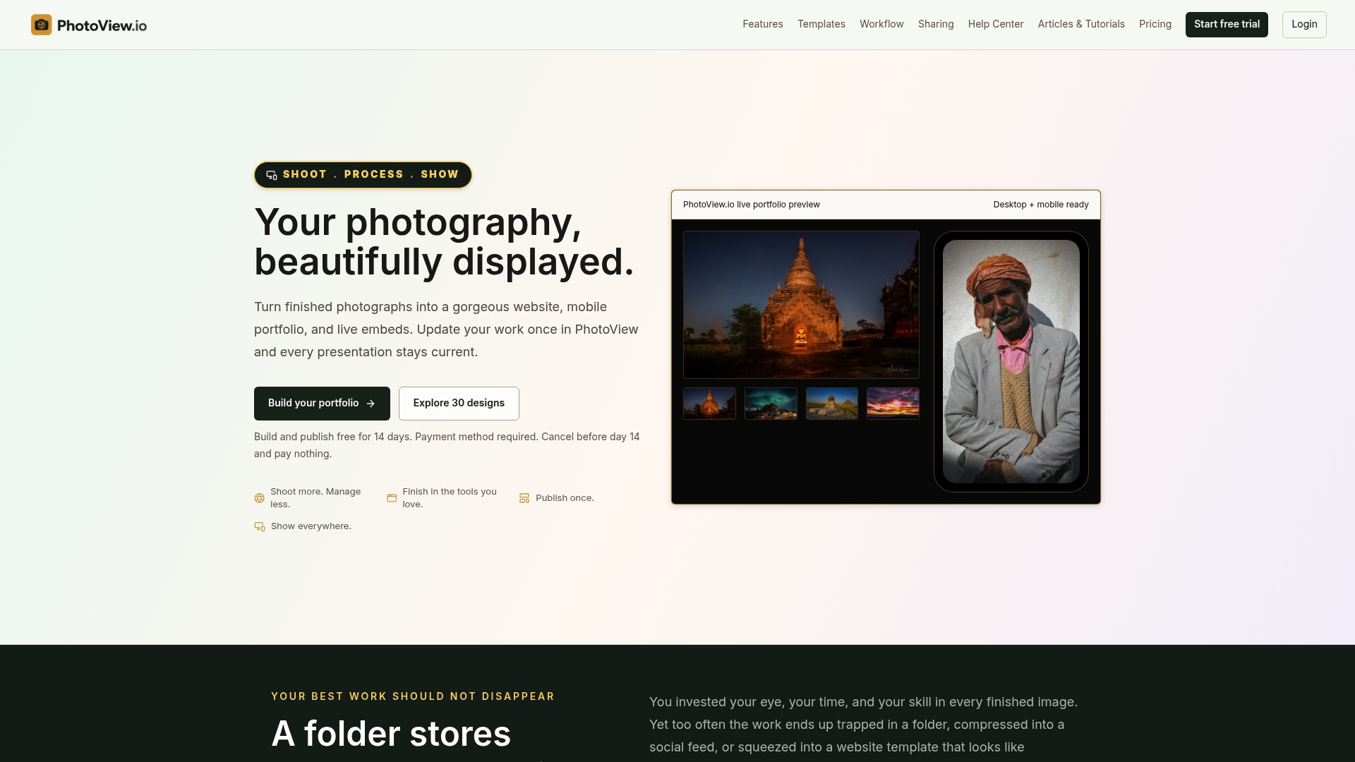
We built PhotoView around the idea that updating your portfolio should take minutes, not an afternoon of resizing files and re-uploading galleries. Every plan includes the full set of over 30 responsive templates, so you are never paying more to unlock the layout that actually fits your genre, and Lightroom publishing or mobile import means your site reflects your latest work without a separate export step.
A few ways to start testing this for your own work:
- Browse the photography website templates to find a layout suited to your genre.
- Try publishing directly from Lightroom if that is already part of your editing routine.
- Test a live embed if you want updated work to appear on a site you already run.
Compare plans and start a trial at Photoview to see how the templates and workflow hold up against your own image library.
FAQ
What is the 20/60/20 rule in photography?
Definitions of this rule vary across photography education sources, and no single authoritative version applies universally. Broadly, it refers to allocating attention across a shoot or a body of work in uneven proportions rather than treating every frame equally, though the exact split and context differ by who is teaching it.
What should I include in a photography portfolio?
A strong portfolio includes your strongest, most representative work organized into clear projects or categories rather than a single undifferentiated grid. Include captions with context, a way for clients to reach you, and, if you shoot professionally, a clear path to your pricing or booking process.
How much do photographers charge for a portfolio?
This question usually refers to what photographers charge clients for photography services, which varies widely by specialty, location, and experience and is not something a general source can state as a fixed figure. If you are asking about the cost of a portfolio website platform instead, plans like PhotoView’s Starter tier start at $3.99 per month or $39.99 per year.
What does the 80/20 rule mean in photography?
The 80/20 rule does not have one fixed, universally cited definition in photography. It is generally used loosely to suggest that a small portion of your shots or effort accounts for most of the usable or impactful results, a version of the broader Pareto principle applied informally to creative work.
Do I need coding knowledge to build a responsive photography portfolio?
No. Platforms built specifically for photographers, including template-based services like PhotoView, handle the responsive layout and image delivery automatically so you do not need to write code to get a mobile-friendly site. Coding knowledge becomes useful only if you want custom behavior beyond what a template editor offers.