
90 Day Launch for Wedding Photography Portfolio Sites With Lightroom
Build a fast, mobile-friendly wedding photography portfolio with curated examples, a vendor-neutral checklist, a 90-day launch plan, and Lightroom-to-web...
90 Day Launch for Wedding Photography Portfolio Sites With Lightroom
Your portfolio has to sell your style in about five seconds. That means an opening image strong enough to stop the scroll, a highlight reel of several photos that shows range without diluting your voice, and at least one full wedding gallery proving you can carry a story from getting ready to the last dance. Start there: pick your best several images, link two full weddings, and add an enquiry form that’s impossible to miss.
TL;DR:
- The highlight reel should include 8 to 12 of your strongest images paired with at least two full wedding galleries to demonstrate consistency and storytelling.
- Organizing full galleries by venue or date helps couples assess your ability to handle different lighting and space conditions specific to their location.
- Your website must have a quick, mobile-optimized load time, with lazy-loading images, compressed formats, and simple navigation to prevent losing mobile visitors.
- Maintain a consistent style across all pages by matching color palettes, typography, and visual elements to reinforce your brand identity.
- Use a portfolio platform that supports direct Lightroom publishing, customizable galleries, and custom domains to streamline updates and improve inquiry conversion.
Table of Contents
- Wedding Photography Portfolio Examples Worth Copying
- What Separates a Standout Wedding Portfolio From a Forgettable One
- The Pages and Booking Flow Your Site Actually Needs
- Image Selection, Speed, and SEO Basics for Photography Sites
- Choosing the Right Platform for Your Wedding Portfolio
- Your 90-Day Launch Plan
- Keeping Your Personal Style Consistent Across the Site
- Why Mobile Optimization Isn’t Optional for Photography Portfolios
- Copyright, Model Releases, and What You’re Legally Allowed to Post
- Lessons From Watching Portfolios Convert (or Fail To)
- Publish Your Portfolio Without Fighting a Website Builder
- Resources for Building Your Wedding Portfolio
- Sources
- FAQ
Wedding Photography Portfolio Examples Worth Copying
You don’t need to reinvent site design. The photographers booking six figures in weddings have already stress-tested the layouts that convert, and most of them fall into a few common patterns.
Full-bleed hero with a single statement image. One photo, no text overlay competing for attention, sized to fill the browser window. This is the layout used by luxury and destination photographers whose editorial portfolios lean on a single powerful frame to set tone before a visitor scrolls an inch.
Editorial vertical scroll. Images run large, one or two per screen, paced like a magazine spread. This works for photographers with a strong storytelling eye because it forces the visitor to slow down and read the sequence instead of skimming a grid and missing the story.
Grid highlight reel. A tight 3 or 4-column grid of your absolute best shots, no captions, no clutter. Best suited to photographers with a bold, consistent color palette. Grids are where micro-inconsistencies show up fast, so use this only when every image belongs in the same visual family.
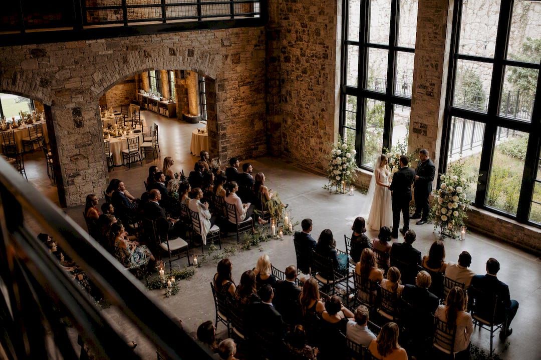
Full-wedding chronological gallery. Ceremony through reception, in order, sometimes many images deep. Regional photographers frequently organize full galleries by venue or location, which helps couples scouting a specific venue see exactly what their day might look like.
Split-screen comparison layout. Detail shot next to a wide shot, portrait next to candid. This suits documentary shooters who want to demonstrate range within a single scroll without needing separate galleries for each style.
Category tabs (Weddings / Engagements / Elopements). A simple navigation pattern that lets visitors self-select the content most relevant to their own booking, cutting bounce from mismatched expectations.
Cinematic dark-mode backgrounds. Black or deep charcoal backdrops that make skin tones and white dresses pop. Fine art photographers use this constantly because it mimics gallery wall presentation.
Minimal white-space grid. The opposite approach: generous margins, small thumbnails, quiet typography. Works well for photographers whose editing style is soft, airy, and light-heavy.
A few rules of thumb for matching pattern to style:
- Documentary shooters do best with chronological full-wedding galleries and split-screen layouts that show storytelling range.
- Editorial and fine art photographers should lean into vertical scroll and dark-mode presentation, where pacing and contrast carry the emotional weight.
- Photographers still building a signature look benefit most from grid highlight reels, since grids expose inconsistency and force editing discipline.
Whatever pattern you choose, the through-line across every high-performing wedding site is the same: a large hero image, minimal navigation friction, and a gallery structure that gets out of the way of the photos themselves.
What Separates a Standout Wedding Portfolio From a Forgettable One
The difference rarely comes down to raw talent. It comes down to discipline in what you choose to show and how consistently you present it.
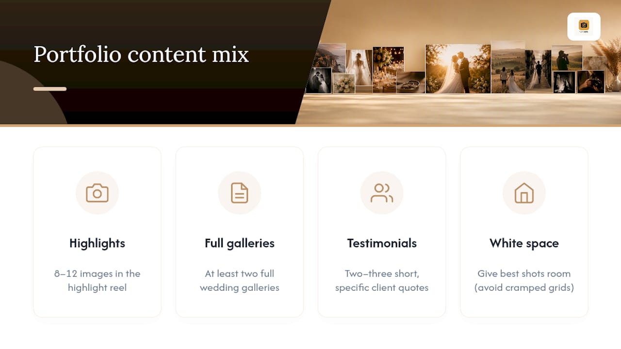
1. Apply the 8 to 12/2 rule. Cap your highlight reel at 8 to 12 images and pair it with at least two full wedding galleries. Fewer highlights and the site feels thin; more and you dilute the impact of your strongest work. Two full galleries give couples enough evidence to judge consistency across an entire event, not just your best five minutes.
2. Sequence for emotion, not chronology alone. Arrange your highlights in a narrative arc, getting ready, ceremony, portraits, reception, so the scroll itself builds toward an emotional payoff rather than reading like a random assortment. This kind of deliberate sequencing is what turns a short scroll into a compressed argument for hiring you.
3. Keep style consistent from the hero image to the footer. Color grading, crop ratios, and typography should feel like one voice. A cool, desaturated hero followed by warm, high-contrast gallery images tells a visitor your editing isn’t settled yet.
4. Let white space do work. Cramped grids with zero breathing room make even excellent images feel cheap. Give your best shots room.
5. Write about text that supports the images, not competes with them. A few honest sentences about how you shoot and why, placed near your galleries, do more than a paragraph of generic marketing copy.
6. Use testimonials sparingly and specifically. Two or three short, specific client quotes near your contact page carry more weight than ten generic ones stacked on a dedicated testimonials wall.
Pro Tip: Put your single strongest testimonial directly under your enquiry form, not buried on a separate page. It’s the last thing a hesitant visitor reads before deciding whether to hit send.
The Pages and Booking Flow Your Site Actually Needs
A beautiful gallery with no path to inquiry is a portfolio, not a business tool. Every wedding photography portfolio website needs a small set of pages, each doing one specific job.
- Home: One hero image, a line of positioning copy, and a clear path into your portfolio. Nothing else competes for attention here.
- Portfolio (highlights): Your curated 8 to 12 best images, organized to show range in light, location, and emotion.
- Full weddings: At least two complete galleries, organized by venue or date, so couples can judge consistency across a full day rather than a highlight reel alone.
- About/Experience: Your story, your process, and how you work on the day. Photographers who include a clear experience page convert better because couples are hiring a personality and a process, not just a camera.
- Services/Pricing: Even a rough starting price or package range filters out mismatched inquiries before they hit your inbox.
- Contact: A short enquiry form, never a bare “email me” link.
Your full-wedding pages should answer the questions couples are actually asking themselves: what does this look like in overcast light, in a tent, in a venue with terrible reception lighting? Show that range deliberately rather than hoping your highlight reel implies it.
Keep your enquiry form to six fields at most: names, wedding date, venue or location, guest count, budget range, and a message box. Anything longer than that and you’ll lose mobile visitors halfway through. Pair the form with a simple note on availability, even something as basic as “currently booking into [year],” since couples want to know if reaching out is worth their time before they type a word.
Image Selection, Speed, and SEO Basics for Photography Sites
A portfolio full of technically perfect images can still fail if it loads slowly or picks the wrong photos. Selection and technical delivery matter equally.
Selection rules:
- Choose emotion-first, not technically-perfect-first. A slightly soft shot of genuine tears beats a tack-sharp shot of posed smiles.
- Sequence images to tell a story rather than dumping your best 50 shots in no particular order.
- Never repeat the same pose, angle, or moment twice in one gallery, even if both versions are strong.
Export and delivery specs:
- Hero images: export at roughly 2,400px on the long edge, compressed to balance sharpness against file size.
- Gallery images: 1,600 to 2,000px on the long edge is plenty for full-screen viewing without bloating load time.
- Use
srcsetso mobile devices load a smaller file instead of the same asset served to a desktop monitor.
Speed and delivery:
- Lazy-load every image below the fold so the browser only fetches what’s currently visible.
- Serve through a CDN and use next-gen formats like WebP or AVIF, which compress far better than standard JPEG at the same visual quality.
- Test your live site with Google PageSpeed Insights or GTmetrix after every major gallery update, not just at launch.
Site speed is one of the most commonly ignored variables. Photographers spend months perfecting a shoot and five minutes compressing the gallery that shows it off, and mobile-first delivery and compression are often overlooked until well after launch, by which point slow load times have already cost inquiries no one ever traces back to the cause.
SEO basics that actually move the needle:
- Name image files descriptively (
smith-wedding-ceremony-vineyard.jpg, notIMG_4821.jpg). - Write alt text that describes the scene, not just the keyword you’re chasing: “bride and groom first look at vineyard venue at sunset” beats “wedding photographer.”
- Add basic structured data (schema markup) identifying your business type and location so search engines can surface you correctly in local results.
Choosing the Right Platform for Your Wedding Portfolio
Platforms for wedding photography portfolio websites generally fall into three categories, and each fits a different working style.
Website builders with photographer templates. Drag-and-drop tools with pre-built layouts. A good photography website builder gets you full-width hero images and clean galleries live without touching code, which suits photographers just starting out or shooting a handful of weddings a year.
Self-hosted CMS with gallery plugins. More control, more flexibility, and considerably more setup and maintenance time. Best for photographers who already have web development skills or a designer on retainer.
Hosted portfolio platforms built specifically for photographers. These sit between the two, giving you photographer-specific gallery controls, client delivery tools, and publishing workflows without the overhead of managing hosting or plugins yourself.
Run any platform you’re considering through this checklist before committing:
- Does it publish directly from Lightroom or your existing editing workflow?
- Can you control gallery layout, ordering, and privacy per project?
- Does it support custom domains so your URL matches your brand, not a subdomain?
- Do you have real SEO control over metadata, alt text, and page titles?
- Is pricing predictable and tied to how much storage you actually need?
Photoview was built around exactly this checklist. It publishes directly from Lightroom, gives you full control over gallery structure and private client sharing, supports custom domains, and prices around storage rather than forcing you into a generic monthly seat fee. Photographers shooting a heavy wedding season particularly benefit from the Lightroom publishing workflow, since it removes the export-upload-repeat cycle that eats hours during peak booking months. For a side-by-side look at how these platform categories differ in practice, the gallery-first platform comparison breaks down the tradeoffs in more detail.
Pro Tip: If you shoot more than 15 weddings a year, prioritize publishing speed over template variety. The photographer who updates their site within days of a wedding beats the one with a prettier template and a three-month backlog.
Your 90-Day Launch Plan
Publishing your site is the easy part. Getting it to actually produce inquiries takes a short, disciplined follow-through.
- Before launch: Curate your final image selection, write a short about section (200 words is enough), install analytics, test your contact form from a phone, and check every gallery on mobile before it goes live.
- Weeks 1 to 4: Add your first two full wedding galleries if they aren’t live yet, and share the site directly with venues you’ve worked with, since they’re a reliable referral source.
- Weeks 4 to 8: Promote the site across social platforms with links back to specific galleries, not just your homepage.
- Weeks 8 to 12: Review your analytics. Track inquiry count, conversion rate from visitor to enquiry, your top landing pages, and page speed scores.
If inquiries are trickling in, but conversion is low, the problem usually isn’t traffic. It’s a gallery or pricing page losing visitors before they reach your contact form. If traffic itself is low, your problem is discovery, not design, and no gallery tweak will fix it.
Keeping Your Personal Style Consistent Across the Site
Your editing style is your brand, and a portfolio that shifts tone from page to page undercuts the very thing you’re trying to sell. If your signature look is warm and film-inspired, your fonts, background colors, and even your about-page photo should echo that style. A cool, minimalist site paired with warm, golden-hour galleries creates a subtle dissonance that visitors feel even when they can’t name it.
Consistency starts with a limited color palette pulled from your own work, not a generic template default. If your galleries lean heavily into greens and warm skin tones, your site’s accent color and buttons should sit comfortably in that same family rather than clashing with a stock blue “Book Now” button. The same goes for typography: a serif font suits a fine art, editorial photographer; a clean sans-serif suits a modern documentary shooter. Mismatched type undermines a carefully built visual identity faster than almost anything else on the page.
Your about page photo, your logo treatment, and even your enquiry form’s confirmation message are all opportunities to reinforce the same voice. A clear point of view on visual identity helps photographers translate an editing style into a consistent brand rather than treating the website as a separate project from the actual photography. Treat every element on the page, not just the galleries, as part of the same visual sentence.
Why Mobile Optimization Isn’t Optional for Photography Portfolios
Most couples browsing wedding photographers do it from a phone, often during a commute or while comparing three tabs side by side. If your galleries don’t resize cleanly, load quickly, and remain tap-friendly, you lose that comparison before a single image registers.
Mobile optimization for a photography site means more than a responsive template. Test your actual galleries, not just your homepage, on a real phone under real mobile data speeds, not office WiFi. Full-bleed hero images that look stunning on a 27-inch monitor sometimes crop awkwardly on a 6-inch screen, cutting off a bride’s face or a key architectural detail. Check every gallery for this before calling it launch-ready.
Navigation matters just as much as image display. Menus that require a hover to reveal a dropdown are dead weight on mobile, since there’s no cursor to hover with. Enquiry forms need large, thumb-friendly tap targets and should never require pinch-zooming to read a label. A dedicated mobile-first portfolio approach treats phone visitors as the default user, not an afterthought retrofitted after the desktop version ships.
Speed compounds all of this. A gallery that takes six seconds to load on WiFi can take twenty on a spotty cell connection, and most visitors won’t wait that long for a stranger’s wedding photos, however good they are.
Copyright, Model Releases, and What You’re Legally Allowed to Post
Publishing wedding photography brings a few legal questions worth settling before, not after, your site goes live. You, as the photographer, generally own the copyright to images you create, but the right to display them publicly is governed separately by your contract with each couple.
Most professional wedding contracts include a usage clause granting you the right to use images for portfolio and marketing purposes. If your contract template doesn’t already include this language, add it before your next booking, not retroactively. Couples occasionally ask that specific images, or their wedding entirely, stay off your public site for privacy reasons, and honoring that request in writing protects both of you.
Model releases apply less directly to wedding photography than to commercial or stock work, since your couple’s contract typically covers usage rights for the event itself. Where it gets murkier is with guests who appear prominently in candid shots. It’s smart practice, though not universally required, to note in your contract that guests may appear in images used for marketing, so your couple can flag any sensitivity in advance.
Vendors you feature, florists, venues, hair and makeup artists, generally don’t require a separate release to be shown incidentally in wedding photos, but tagging them respectfully on social media and giving credit where a specific detail shot highlights their work builds the kind of referral goodwill that keeps venues recommending you.
Lessons From Watching Portfolios Convert (or Fail To)
The single biggest lever I’ve seen photographers underuse is the full wedding gallery. Photographers obsess over their highlight reel and treat the full gallery as an afterthought, but couples who are seriously comparing photographers almost always click through to a complete wedding before reaching out. It answers the question a highlight reel can’t: what happens when the light is bad, the timeline runs late, or the ceremony venue is dim and awkward. Venue familiarity matters here too. Couples researching a specific location respond strongly to seeing that exact venue in your work, which is why organizing at least one gallery by venue pays off disproportionately.
The most common mistake I see is an overcrowded gallery married to a slow-loading homepage, usually because a photographer wanted to prove range by including everything. Cut the gallery down, compress the images, and watch bounce rate improve within a week.
My counterintuitive take: a slightly smaller, ruthlessly curated portfolio consistently outperforms a larger, “complete” one. Couples don’t want proof you can shoot every kind of wedding. They want proof you can shoot theirs.
— Mitch Russo
Publish Your Portfolio Without Fighting a Website Builder
PhotoView is built for exactly the workflow this article just walked through: curate your best work, publish full weddings alongside your highlight reel, and keep your site current without relearning a new tool every wedding season. You get access to responsive templates designed for gallery-first presentation, direct publishing from Lightroom so your edited selects go live without a separate export step, private galleries for client delivery alongside your public portfolio, and custom domain support so your URL matches your brand instead of a generic subdomain.
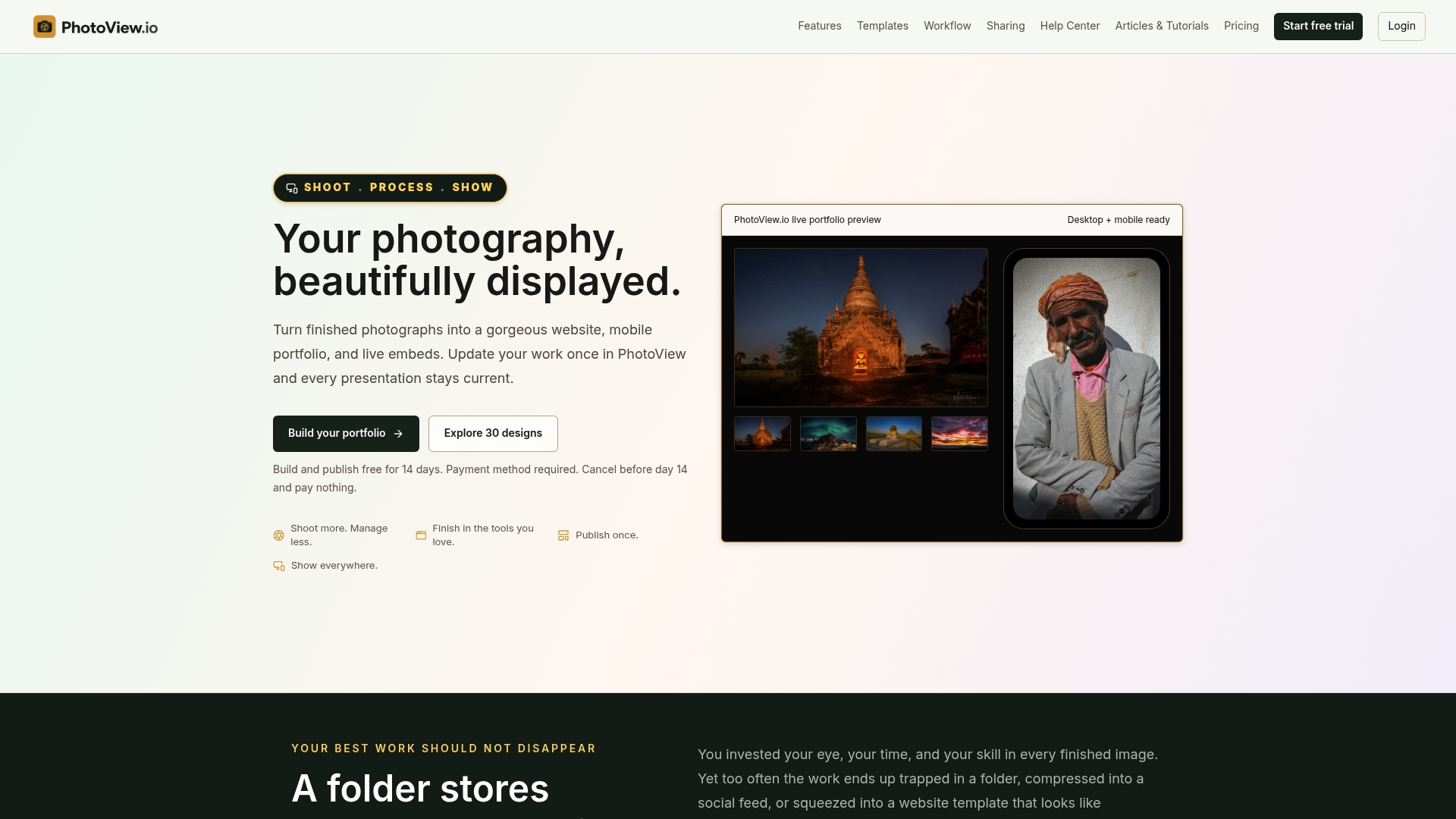
A typical workflow looks like this: finish culling and editing in Lightroom, publish your hero image and two full wedding galleries straight from the PhotoView dashboard or the Lightroom plugin, and your site updates without you touching a line of code or waiting on a developer. If you’re comparing template options first, browse the photography website templates built specifically for portfolio-first presentation, then start a trial and have your first gallery live before your next inquiry lands in your inbox.
Resources for Building Your Wedding Portfolio
- Photography portfolio examples and presentation ideas for more layout inspiration.
- Portfolio website vs. client proofing gallery, if you’re deciding what’s public versus private.
- Build a portfolio with photos and video for mixed-media galleries.
- Browse real photographer sites like Kelsey Sheehan Photography for regional, venue-organized portfolio structure.
Sources
- Luxury Destination Wedding & Editorial Photography - KT Merry
- Joanna Liu Photography | LA + NYC Wedding Photographer
- Free online photography website maker | Canva
- Portfolio | Wedding Photographers in RI | Kelsey Sheehan
FAQ
What is the best website for a photographer’s portfolio?
The best option depends on your workflow: dedicated hosted portfolio platforms like PhotoView give wedding photographers Lightroom publishing and gallery controls that general website builders don’t, while builders with photographer templates suit photographers who want the fastest possible launch.
Is $4,000 a lot for a wedding photographer?
It depends heavily on market and coverage hours, and it’s rarely “a lot” in absolute terms without knowing hours, deliverables, and location.
What is the 8 to 12/2 rule for a wedding portfolio?
It’s a practical curation guideline: cap your highlight reel at 8 to 12 of your strongest images and pair it with at least two full wedding galleries, giving visitors both an emotional first impression and evidence of consistency across a complete event.
What is the best website for wedding photography?
There’s no single universal answer, but the strongest wedding photography sites share the same traits: a full-bleed hero image, at least one full wedding gallery, fast mobile load times, and an obvious enquiry form, all of which a platform built specifically for photographers, like PhotoView, is designed to deliver out of the box.