
Check Your Website on Desktop and Mobile
Use the responsive canvas to catch image crops, long headings, menu issues, and spacing problems before visitors see them.
What you’ll accomplish
You will complete a repeatable desktop-and-mobile quality check of every important page.
Before you begin
- Save the current draft so the review starts from a known state.
- Make a short list of every visible page, portfolio destination, button, and special interaction you need to test.
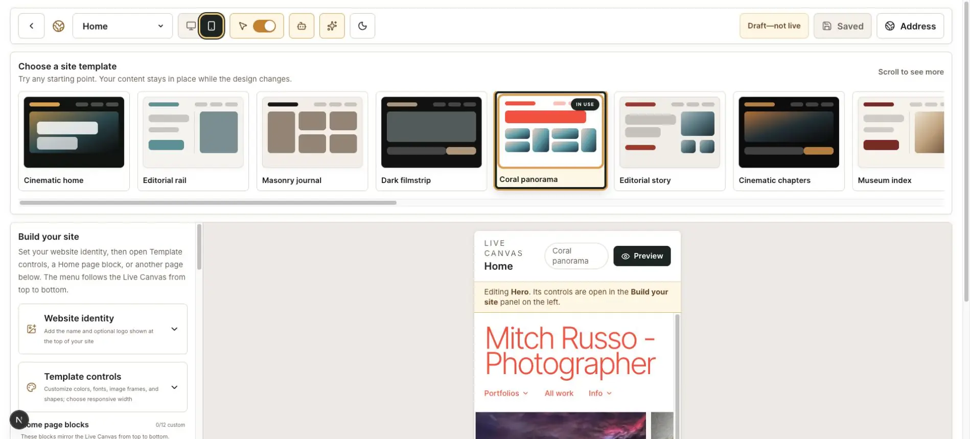
Start with desktop
Select the desktop canvas button and review the header, Hero, every Home block, footer, and primary pages.
Click menus, portfolio covers, viewers, previous and next controls, and any film strip or contact sheet.
Switch to mobile
Select the phone canvas button. Review the same journey instead of checking only the top of the Home page.
Watch for names that wrap badly, labels that collide, buttons that feel too small, and text that sits too close to the edge.
Inspect photograph framing
Check faces, horizons, architecture, and panoramas. If Fill frame removes essential content, use Show full image or choose a more flexible source image.
Check reading and interaction
Confirm that body text is readable, captions are not clipped, overlays have enough contrast, and horizontally scrolling presentations provide an obvious way to move.
Open Accordion Story chapters, run slideshows, move through split-screen arrows, and watch at least one complete scrolling-headline cycle. A layout can fit correctly while its interaction still feels too fast, too high, or unclear.
Repeat after major changes
Run this check whenever you change the template, identity, Hero, navigation, or page order. Save only after both canvas sizes are satisfactory.
Finish with this checklist
- Navigation, logo, headings, and buttons remain readable and tappable.
- Faces, horizons, panoramas, and architecture are not damaged by unintended crops.
- Scrolling headlines, film strips, slideshows, Accordion Story chapters, and viewers work at both sizes.
- No Save control or floating tool covers a setting or selection.
- Every visible page has been checked—not only the top of Home.