
Photographers' Full Screen Photo Gallery: Keep Ratios, Meet WCAG 2.2
Build a full screen photo gallery that preserves native proportions, supports WCAG 2.2 keyboard access, loads quickly, and publishes from Lightroom.

Photographers’ Full Screen Photo Gallery: Keep Ratios, Meet WCAG 2.2
A full screen photo gallery is an edge-to-edge, portfolio-first viewer that lets your images fill the screen without browser clutter pulling focus. Start with a responsive masonry or native-aspect grid feeding into a keyboard-accessible fullscreen lightbox that meets WCAG 2.2 standards. We built PhotoView to help photographers present their work across devices.
TL;DR:
- Use masonry or native aspect ratios to preserve framing; reserve tighter grids for commercial collections where product consistency outweighs individual composition.
- Meet WCAG 2.2 Level AA with arrow key navigation, Escape to close, contained focus returning to its trigger, visible indicators, and screen reader announcements.
- Resize images before upload, serve device specific versions through srcset, offer AVIF or WebP with JPEG fallback, lazy load below the fold, and preload adjacent frames.
- Start with 15 to 30 selected images, export at capped widths, and prepare descriptive filenames, alt text, and captions before uploading.
PhotoViewShowcase Photos Without Losing Their FramingPhotoView helps photographers publish finished photos and videos in responsive portfolio templates, with galleries and presentations for different screens.Explore PhotoView
Table of Contents
- What a portfolio-first full screen gallery actually is
- Masonry, native aspect, and protecting your composition
- Keyboard navigation, focus, and contrast that actually work
- Performance and image optimization for fast, large galleries
- The viewer features that make a gallery feel polished
- Preparing files and publishing from Lightroom to web
- A practical checklist before you launch
- Why protecting composition is part of the craft
- Publish a Lightroom-ready full screen gallery with PhotoView
- FAQ
- Sources
What a portfolio-first full screen gallery actually is
In this guide, a full screen photo gallery means your portfolio displayed edge-to-edge for maximum visual impact, not full-screen wallpapers or stock photo browsers. The distinction matters because the design priorities are different: you’re protecting composition and brand, not just filling pixels.
This presentation style works for portfolio landing pages, client proofing sessions, in-person slideshows during consultations, and hero galleries that open a photography website with a strong first impression.
Full screen enhances impact when the work itself is the pitch: a fine art series, a wedding story, a commercial lookbook. A smaller or mixed layout serves better when you’re mixing text-heavy case studies with images, or when a client needs to compare thumbnails side by side before committing to a full view.

Masonry, native aspect, and protecting your composition
Forced-aspect grids crop every image into the same rectangle. They look tidy, but cropping a vertical portrait to fit a square tile can cut off a hand, a horizon, or the exact detail that made the shot work. Masonry and native-aspect layouts preserve each photograph’s original proportions, which protects the compositional choices you made in camera.
Three patterns cover most portfolio needs:
- Gallery grid plus fullscreen modal: thumbnails in a masonry layout open into a dedicated fullscreen viewer on click.
- Single-image hero with thumbnail strip: one large photo dominates with a scrollable strip below, good for sequential storytelling like weddings.
- Slideshow mode: automatic or manual advance through a curated set, suited to in-person presentations or kiosk displays.
Editorial and fine art portfolios generally favor masonry grids that respect native aspect ratios. Wedding photographers often lean on the hero-plus-strip pattern to narrate a day in order. Commercial work sometimes benefits from a tighter grid when consistency across a product line matters more than individual framing.
Keyboard navigation, focus, and contrast that actually work
A fullscreen gallery that only works with a mouse excludes a meaningful share of visitors, and it also fails baseline accessibility expectations that increasingly matter for search visibility and professional credibility.
- Arrow keys move between images, and Esc closes the lightbox without trapping focus elsewhere on the page.
- Focus stays contained inside the open modal until the visitor closes it, then returns to the trigger element.
- Visible focus indicators show keyboard users exactly where they are at every step.
WCAG 2.2 Level AA sets the baseline most professional sites aim for: clear focus indicators, sufficient color contrast between text and background, and ARIA semantics that tell screen readers when a gallery has opened, which image is active, and how many remain. The full Web Content Accessibility Guidelines (WCAG) 2.2 specification covers the complete set of success criteria behind these basics.
Add descriptive alt text and visible captions for every image, confirm your layout reflows cleanly when text resizes to 200%, and test the whole gallery with a keyboard alone, then again with a screen reader.
Pro Tip: Unplug your mouse and try to open, browse, and close your own gallery. Anything you can’t reach by keyboard is a gap a visitor will hit too.
For a broader primer on why this pays off beyond compliance, this accessibility and SEO overview walks through the search visibility side of the equation.
Performance and image optimization for fast, large galleries
A gorgeous fullscreen gallery that takes too long to load can lose visitors before they see a single frame. Pre-resize display images before upload, capping width to common screen sizes, rather than letting browsers scale down multi-megabyte originals on the fly.
- Serve
srcsetandsizesattributes so each device downloads only the resolution it needs. - Offer modern formats like AVIF or WebP with a JPEG fallback for broader browser support, an approach demonstrated in the Lumen Next.js photography template.
- Lazy-load images below the fold and use low-quality image placeholders so the layout doesn’t jump while full images arrive.
- Preload the next and previous images in a fullscreen sequence so navigation feels instant.
- Lean on a CDN for large collections so delivery speed doesn’t depend on a single server’s location.
The MasuRii photography portfolio template shows this combination in practice: responsive galleries, lightbox viewers, and LQIP placeholders built with a low-JavaScript approach that keeps load times down even with image-heavy pages. Our own responsive portfolio approach covers responsive portfolios.
The viewer features that make a gallery feel polished
The controls inside your fullscreen viewer are where photographers either win or lose a visitor’s attention. Keyboard left and right arrows, swipe gestures on touch devices, Esc to close, a fullscreen toggle, and play and pause controls for slideshow mode cover the core interaction set visitors expect.

Captions, photo credits, and optional EXIF or metadata display add context without requiring a click away from the image. Share and download controls belong only where you actually want visitors redistributing your work, since many photographers prefer to keep client galleries locked down.
Smooth transitions and preloaded adjacent frames keep browsing feel continuous rather than stop-start. The best interfaces keep their chrome subtle: a thin caption bar, a faint close icon, nothing that competes with the photograph itself. The Keep It Katelin photography project demonstrates this balance with a fullscreen modal, keyboard navigation, and custom preloading that removes flicker between frames.
Preparing files and publishing from Lightroom to web
A clean workflow saves hours once you’re managing multiple galleries. Before upload, nail down three things:
- Choose export sizes that match your display’s capped width rather than exporting full-resolution originals.
- Use descriptive filenames that help with organization and search.
- Write alt text and captions for each image before upload, not after.
Publishing straight from Lightroom removes a manual export-and-upload cycle entirely. Our Lightroom publishing solution lets you push edited images to your live portfolio from inside Lightroom, so a finished edit session ends with a published gallery rather than a folder of files waiting to be uploaded elsewhere.
Developers comfortable with code may prefer static templates they control line by line. Photographers who want faster iteration without touching code generally do better with a hosted platform, while static exports suit anyone prioritizing low-cost hosting over flexibility.
A practical checklist before you launch
- Pre-upload: select a tight edit of 15 to 30 hero images, export at capped widths, and write alt text and captions for each.
- Implementation: choose a masonry or native-aspect layout, build keyboard navigation and ARIA roles into the lightbox, set
srcsetwith modern formats, and enable lazy loading. - Testing: navigate the whole gallery using only a keyboard, test swipe gestures on a real phone, resize text to 200%, and check color contrast against your background.
Our guide to curating images from Lightroom to web walks through the selection step in more detail if narrowing down a shoot feels like the hardest part.
Why protecting composition is part of the craft
Cropping a photograph to fit a tidy grid is a design shortcut, not a design choice. Preserving native aspect ratios respects the framing decisions you made with a viewfinder, and treating accessibility and load speed as craft rather than afterthought shows in how a gallery feels to use. Start with a small, deliberately curated set. Expand once you know it loads fast and reads clearly for everyone who opens it.
— Mitch Russo
Publish a Lightroom-ready full screen gallery with PhotoView
We built PhotoView for photographers who want their portfolio to look as good on a phone as it does on a large monitor, without rebuilding a website every time a new shoot is ready. Update your work once and it reflects everywhere your gallery appears, across templates, mobile, and embedded pages.
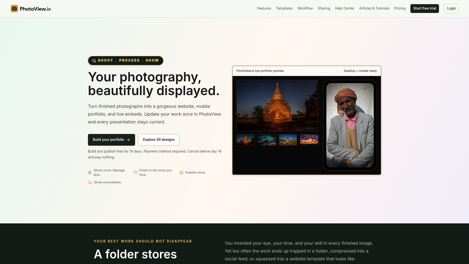
- Publish directly from Lightroom into your portfolio.
- Choose from responsive portfolio templates.
- Share private client galleries with controlled access.
- Mix photos and video in a single portfolio without switching tools.
Explore our Lightroom publishing solution or browse the full portfolio publishing solutions overview to see which template fits your work. Plans start at $3.99 per month on the Starter tier, with Growth, Studio, and Premier options available as your storage needs grow.
FAQ
How do I test my gallery for accessibility?
Navigate the entire gallery using only a keyboard, checking that arrow keys move between images and Esc closes the lightbox without trapping focus. Then test with a screen reader to confirm ARIA labels announce the current image and gallery state, following the baseline set by WCAG 2.2.
What image size should I export for a full screen gallery?
Export at a capped width matched to common display sizes rather than uploading full-resolution originals, then serve multiple sizes through srcset so each device downloads only what it needs. This keeps load times fast without sacrificing visible quality in the fullscreen view.
Do fullscreen galleries work well on mobile with swipe gestures?
Yes, a well-built fullscreen viewer supports swipe left and right for navigation alongside the keyboard controls used on desktop. Templates like the Lumen Next.js photography template show this pattern working alongside a filterable masonry layout.
Can I share a private full screen gallery with clients only?
Yes, private sharing lets you share galleries with clients, which suits proofing sessions and client delivery. Our private photo sharing option is part of the publishing workflow.
Does a full screen gallery hurt my site’s SEO?
Not when built correctly: lazy loading, descriptive alt text, and fast-loading optimized images support both accessibility and search visibility rather than working against it. A web accessibility and SEO primer covers how these practices reinforce each other.